INTRODUCTION
This is not a client project. It's a self-initiated one, and that distinction matters.
Robledo Studio is my independent web design and development practice. Building it required the same process I apply to any client project: research, positioning, information architecture, UX strategy, visual design, and a live Framer build. But also, with an added layer of complexity: I was simultaneously the designer, the client, the user, and the operator. Every decision had to work from all four perspectives at once.
MY ROLE
Role
UX Designer, UI Designer, Brand Strategist, Framer Developer, Service Designer
Responsibilities
Discovery, content strategy, information architecture, brand direction, UI design, Framer development, UX/UI QA
Methodology
Understand → Structure → Design → Build → Review → Launch
Tools
Figma, Framer, Adobe Photoshop
OVERVIEW
The goal wasn't to build a portfolio website. It was to design a complete service experience, from first impression to project handover, that could be run sustainably by one person while feeling professional and trustworthy to clients.
The result is a studio system: live responsive website, structured service offering, client journey, operational processes, pricing framework, CRM, and post-launch support model. All designed and built from scratch.
CHALLENGE
Independent service businesses often fall into an awkward gap. They've outgrown DIY website builders, but large agencies can feel too expensive, impersonal, or process-heavy. At the same time, many freelance design experiences are fragmented; strategy, design, development, pricing, and communication can all feel disconnected or unclear.
The challenge was to design a studio experience that felt professional but personal, structured without being bureaucratic, and transparent from enquiry to launch. Simple enough for a solo studio to operate sustainably, and trustworthy enough for a client to feel confident handing over their business's digital presence.
The central design question: how might I create a web design service that gives established service businesses the quality and structure of an agency, while keeping the relationship direct, calm, and easy to understand?
RESEARCH
The project began with competitive and market exploration across independent studios, agencies, freelance designers, service packaging models, pricing structures, client onboarding flows, and Framer-based studios, locally and internationally.
The main opportunity that emerged wasn't simply better visual design. It was clarity and predictability. Clients needed to understand what they were buying, who the service was for, what the process looked like, when their input was needed, what happened after launch, and what was out of scope.
This led to the central positioning: calm, clear, and systematic. And the internal operating principle: friendly on the surface, structured underneath.
Two users shaped every decision throughout the project.
The primary user is an established or growing service business owner who has outgrown DIY websites, cares about quality and reputation, and needs clearer digital communication — but doesn't want large-agency complexity or jargon. Representative sectors include wellness, architecture, psychology, boutique real estate, and professional services.
The secondary user was equally important: me, the studio founder & designer. The system needed to be realistic for one person to run. A beautiful client experience built on an unsustainable process would fail. Both users had to be served simultaneously.
DESIGN PROCESS
UX DECISIONS
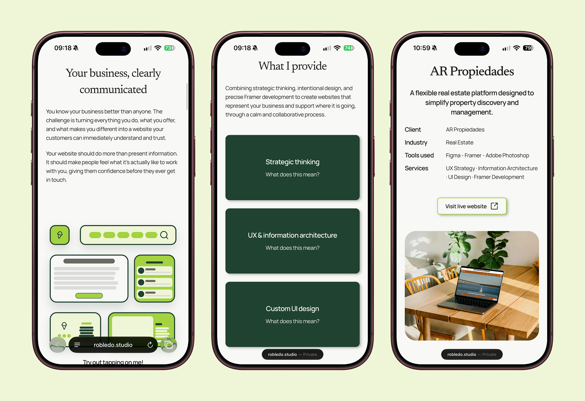
The homepage was structured around the questions a prospective client is most likely to ask, in the order they naturally ask them: What do you do? Do you understand businesses like mine? What exactly do you provide? Can I trust the quality? How does your process work? What do you believe in? What options are available? Who will I actually work with? What should I do next?
This became: Hero → Empathy → Capabilities → Work → Process → Philosophy → Services → Founder → CTA.
The hero was kept deliberately text-led to communicate the value proposition before introducing any visual complexity. One of the strongest UX concepts appeared in the empathy section, where scattered cards representing ideas, content, goals, assets, audience, and uncertainty reorganise through interaction into a structured website. The interaction communicates the service proposition visually: messy business information becomes clear digital structure.
INFORMATION ARCHITECTURE
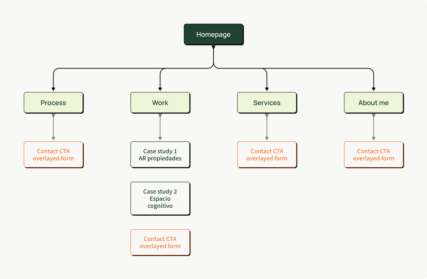
The public website and the actual service journey were designed as two connected systems.
The website covers: Home, Process, Services, Work, About, Contact, Case studies, and Legal.
The client journey covers: Discover → Enquire → Qualify → Discovery → Proposal → Contract → Payment → Understand → Structure → Design → Develop → Launch → Support.
Several client-experience decisions were treated as UX decisions rather than operational policies: enquiry before direct booking, one primary decision-maker per project, consolidated feedback rounds, clear milestone approvals, defined feedback turnaround expectations, visible payment milestones, and transparent out-of-scope handling.
SERVICE ARCHITECTURE
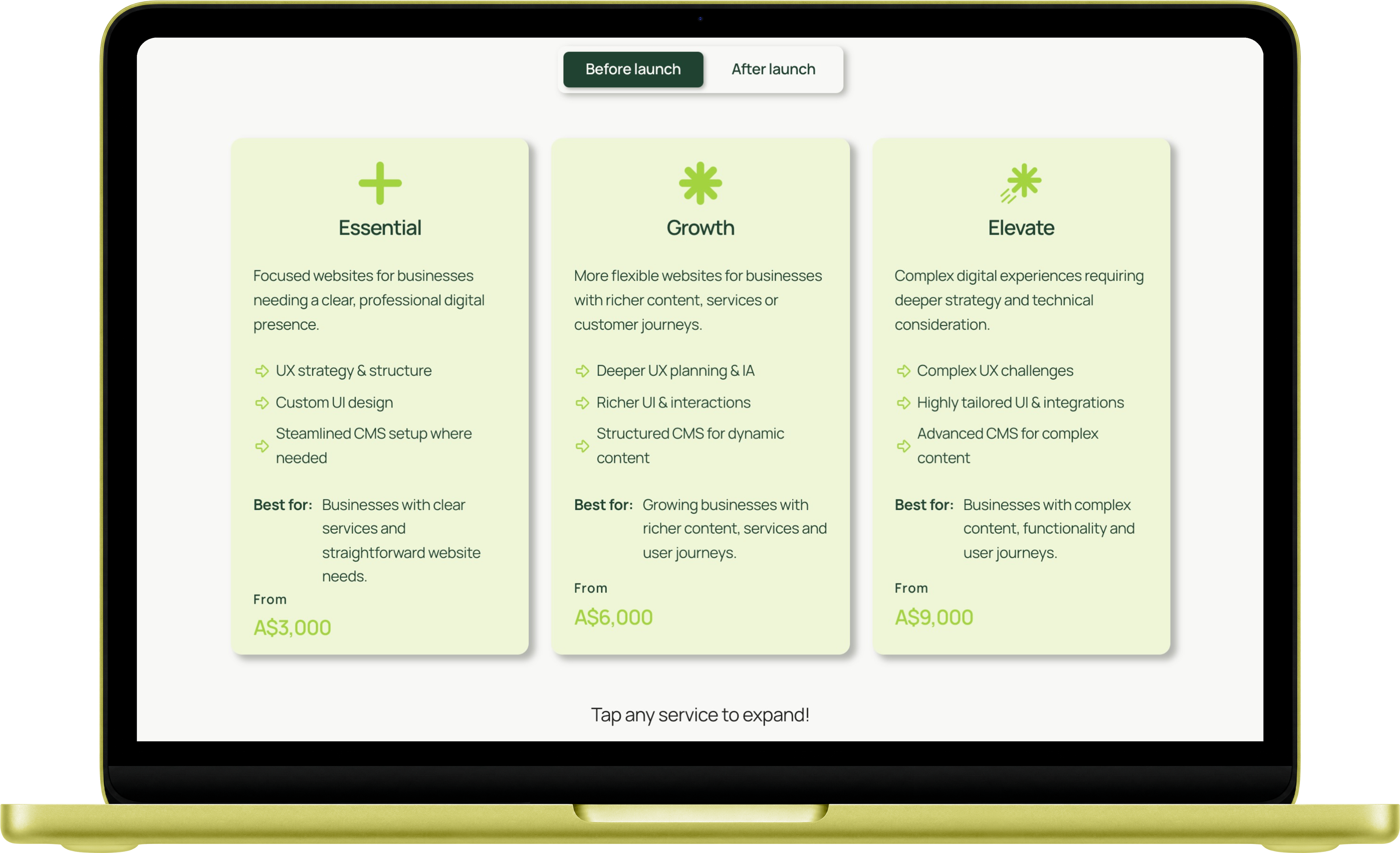
The studio service was designed as a structured offering rather than a flexible quote-based approach, because too much flexibility creates uncertainty for clients and complexity for the operator.
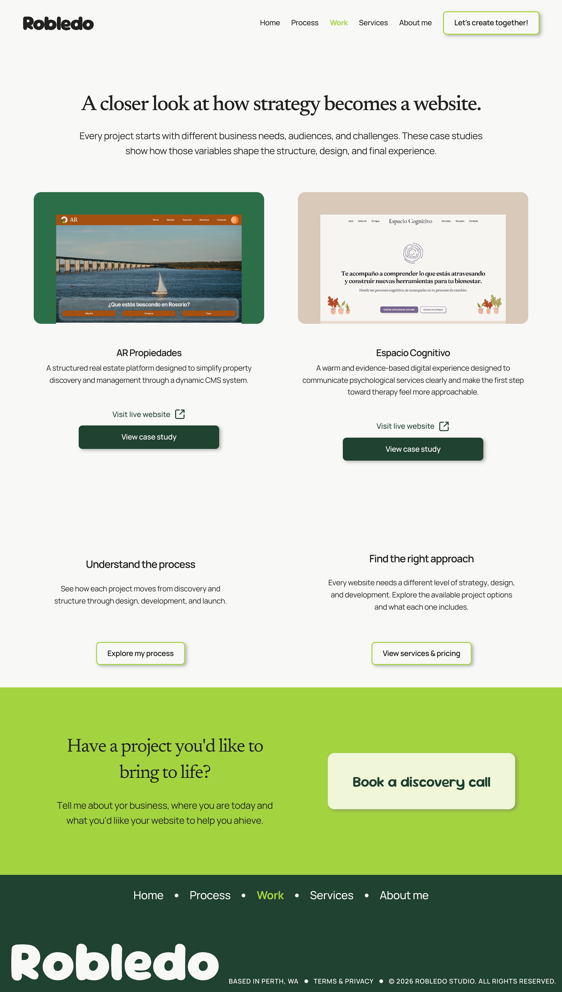
Three engagement levels were defined: Essential, Growth, and Elevate, reflecting project complexity rather than perceived quality tiers. Instead of positioning them as good, better, best, they reflect the actual scope of what's involved.
Project fit is supported by a seven-category complexity scoring model covering business complexity, UX and IA depth, interaction design, CMS requirements, integrations, motion, and client collaboration level. The score informs the recommended engagement while professional judgement remains part of every decision.
The five public delivery phases, Understand, Structure, Design, Develop, and Launch, were designed to make the process easy for clients to follow and remember, reducing ambiguity at every step.
VISUAL STYLE
The visual language was built around calm professionalism with selective personality.
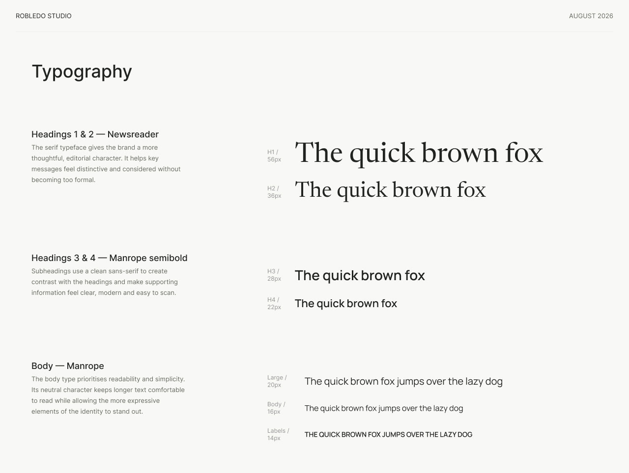
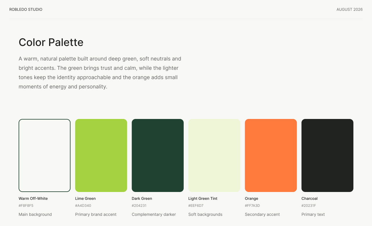
Typography pairs Newsreader for editorial expression with Manrope for functional clarity. The colour system uses a warm neutral base, bright green as the primary studio accent, and orange used sparingly for personal voice moments.
The guiding idea: green for the studio, orange for the person. This distinguishes the professional system from the founder's personality without creating two separate brands.
A consistent interactive graphic system runs through several key sections of the site. The empathy section uses animated, reorganising cards to visually communicate the service proposition. The process section uses the same graphic language to represent each delivery phase in a way that's memorable and scannable rather than purely text-based. This system creates visual continuity across the site without relying on illustration or photography, keeping the aesthetic clean while still feeling considered and alive.
The About page was designed with a deliberately different energy. Where the rest of the site is structured and systematic, the About page introduces more playful, personal elements. Looser layouts, warmer copy, and design moments that reflect my personality rather than the studio's professional positioning. The intention was to show through without disrupting the overall brand tone, giving prospective clients a sense of who they'd actually be working with.
PAGE BY PAGE
HOMEPAGE
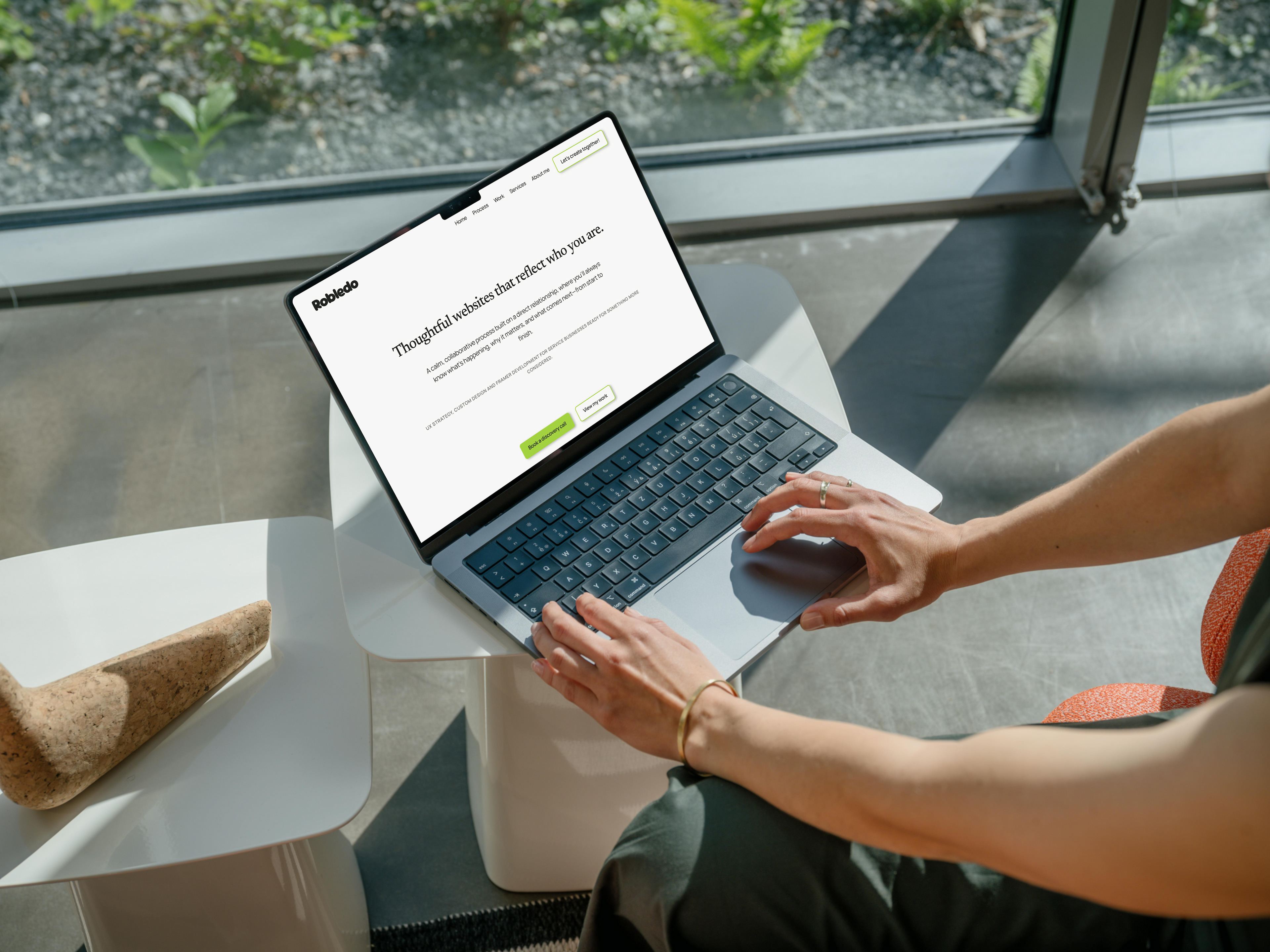
Structured around the sequence of questions a prospective client asks on a first visit, moving from orientation and empathy through to capabilities, process, services, and a discovery call CTA. The hero is text-led to communicate the value proposition before introducing visual complexity. The empathy section uses an interactive card system to show rather than tell: scattered elements representing a client's ideas and goals reorganise into structure through interaction.
PROCESS
A dedicated page explaining the five delivery phases in enough detail for a prospective client to understand what's involved, what their role is, and what to expect. Transparency about process is a core part of the studio's positioning, and this page is where that commitment is made explicit.


SERVICES
Presents the three engagement levels alongside the complexity framework that informs project fit. Pricing is displayed openly as a deliberate transparency decision: clients who aren't the right fit self-select out before a discovery call, saving time on both sides.
ABOUT ME
Designed with a different tone from the rest of the site, warmer, looser, and more personal. Introduces me as the person behind the studio, with playful layout moments and copy that give prospective clients a clear sense of who they'd actually be working with.

WORK
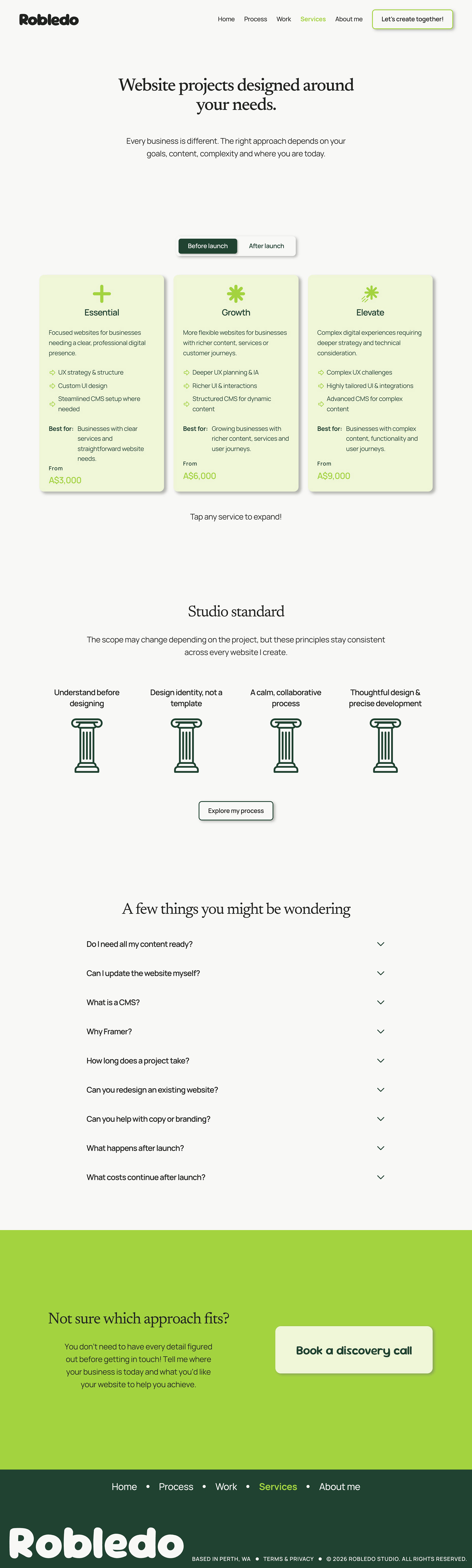
A curated selection of completed projects kept intentionally clean and visual, letting the work speak before copy does. Each entry links to a full case study and a live website.
CONTACT/ENQUIRY
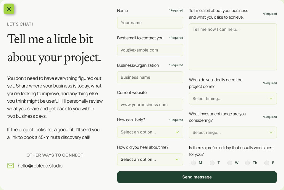
Prospective clients are invited to request a discovery call rather than submit an open-ended message, which sets the right expectations from the first interaction and makes the discovery call more productive. This was implemented as an overlay form accessible from every page rather than a whole page by itself.
Development
Taking it live — development in Framer
The website was designed and developed directly in Framer, keeping design and implementation closely connected. This made it possible to test responsive behaviour, CMS structures, interactions, reusable components, real content, animations, live forms, and SEO behaviour iteratively rather than as a final handoff step. Development became part of the UX process rather than a separate phase.
The outcome
The final result is a fully launched studio system with a live, responsive website, clear positioning, structured service offering, two detailed client case studies, a complete enquiry and sales flow, client operations framework, legal and payment structure, CRM, and outreach strategy.
The most important outcome wasn't the website itself. It was creating a coherent experience across:
brand → website → enquiry → sales → delivery → handover → ongoing support
Every part of that chain was designed, not just the part visitors can see.
LIVE WEBSITE
TAKEAWAYS
IMPACT
Robledo Studio demonstrates that design thinking applies beyond screens. The product here is a service experience. One where clarity, predictability, and trust are the primary UX goals. A client who understands exactly what they're buying, what happens next, and who they're working with is a client who can commit with confidence.
my learnings
Designing for yourself can be harder than designing for a client. There's no external brief to anchor against, no user to interview, and no feedback that isn't filtered through your own assumptions and biases.
This project pushed me to apply research, structure, and iterative thinking to a problem where I was simultaneously the designer and the subject.
The most valuable outcome was learning how designing for yourself forces you to confront your own biases. Without a client brief to anchor against or a user to interview, every assumption goes unchallenged unless you deliberately challenge it. This project pushed me to treat my own beliefs about pricing, process, and positioning as hypotheses rather than facts, and to do independent research that was honest rather than self-confirming.
NEXT STEPS
Robledo Studio will evolve as the practice grows. New case studies added as projects complete, service structures refined based on real client feedback, and operational systems improved through use. The website and the service it represents are designed to scale gradually without requiring a full redesign.