INTRODUCTION
The same family, a bigger canvas
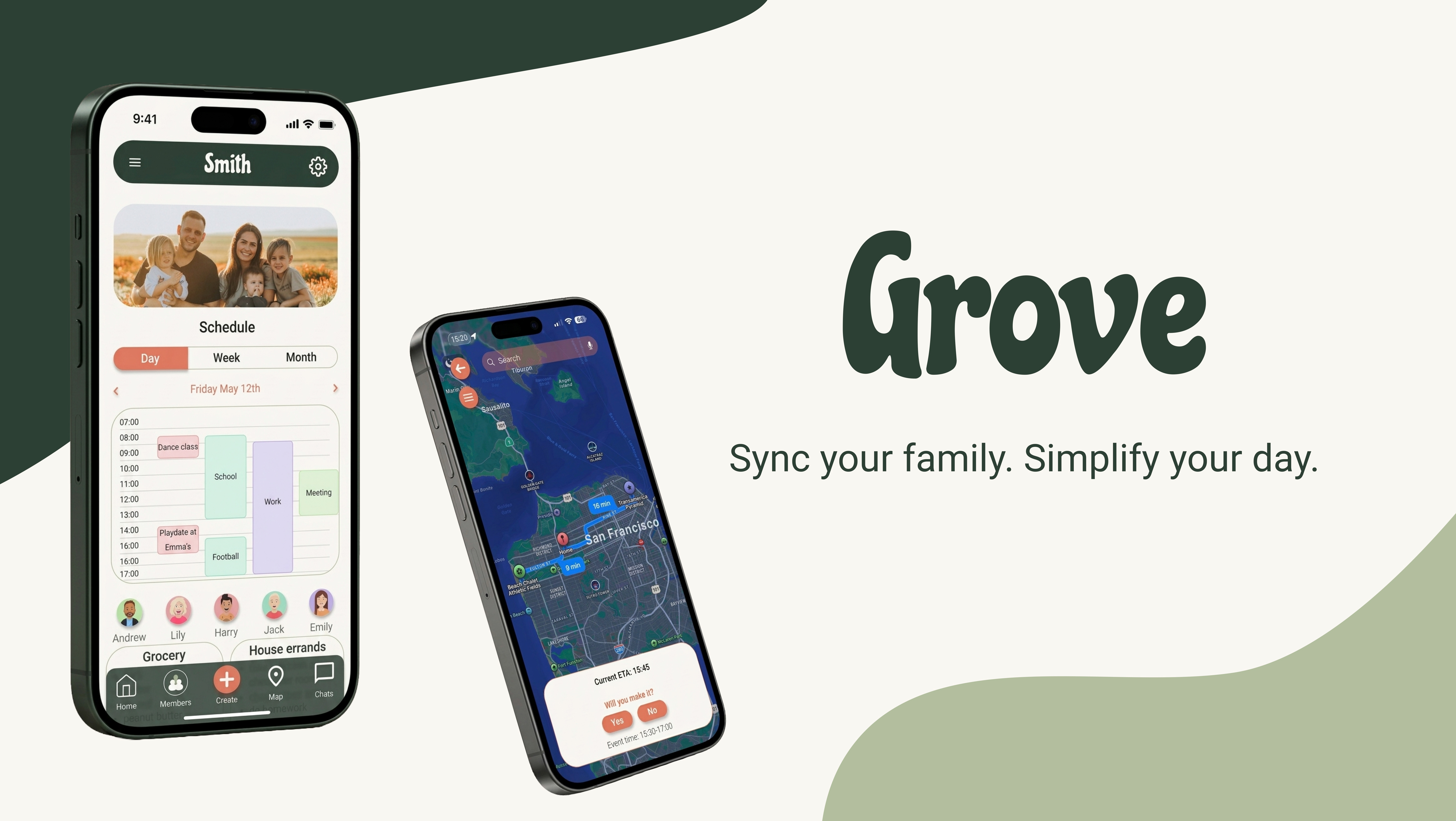
This project is the natural continuation of the Grove mobile app. Built on the same research and design principles, the responsive website adapts the experience to desktop, taking advantage of the extra screen real estate, without losing the simplicity that makes the app work for such a wide range of users.
The challenge here wasn't starting from scratch. It was knowing which parts of the mobile experience to carry over faithfully, which to rethink for a larger screen, and what new value could be added when users have more space and time to engage.
MY ROLE
As with the mobile app, this was a solo end-to-end project covering information architecture, layout design, and responsive UI decisions.
Role
UX & UI designer
Responsibilities
- IA
- layout design
- responsive adaptation
- prototyping
Methodology
Design thinking
Tools
Figma
Design process
The website needed to feel like a natural extension of the app: familiar enough that existing users would feel at home, and spacious enough that desktop users would feel they were getting something more.
The core design decisions were:
PERSISTENT TOP NAVIGATION
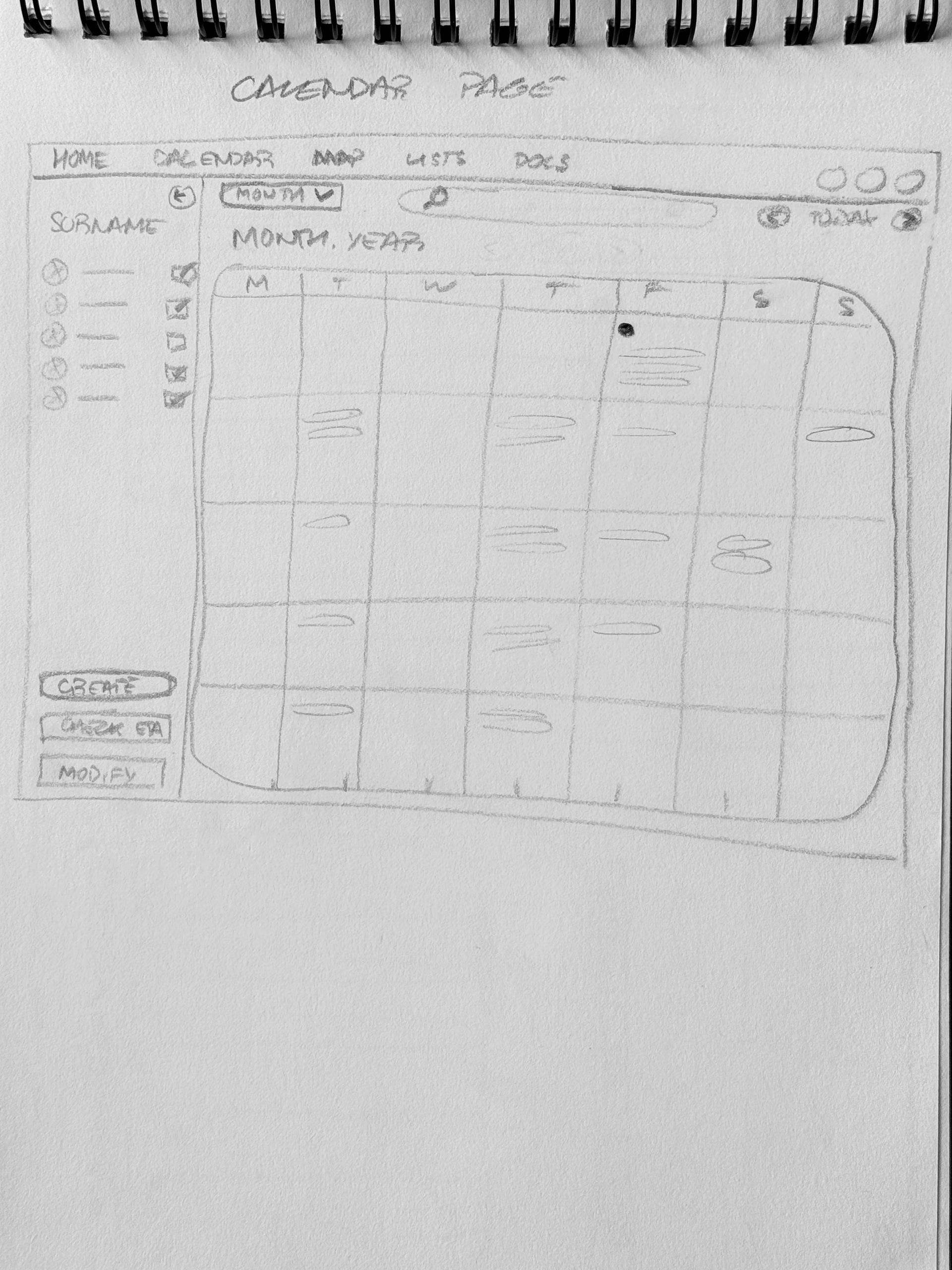
Rather than a bottom tab bar like the mobile app, the desktop experience uses a top navigation bar that stays visible at all times. Every section of the app is reachable from anywhere, keeping orientation effortless, especially important for less tech-savvy users like grandparents or older family members.
HIERARCHICAL NAVIGATION MODEL
The site is structured so that every section is accessible from the home page, and from every other page through the persistent nav. This open, non-linear structure gives users the freedom to move through the app on their own terms, without ever feeling lost or locked into a single path.
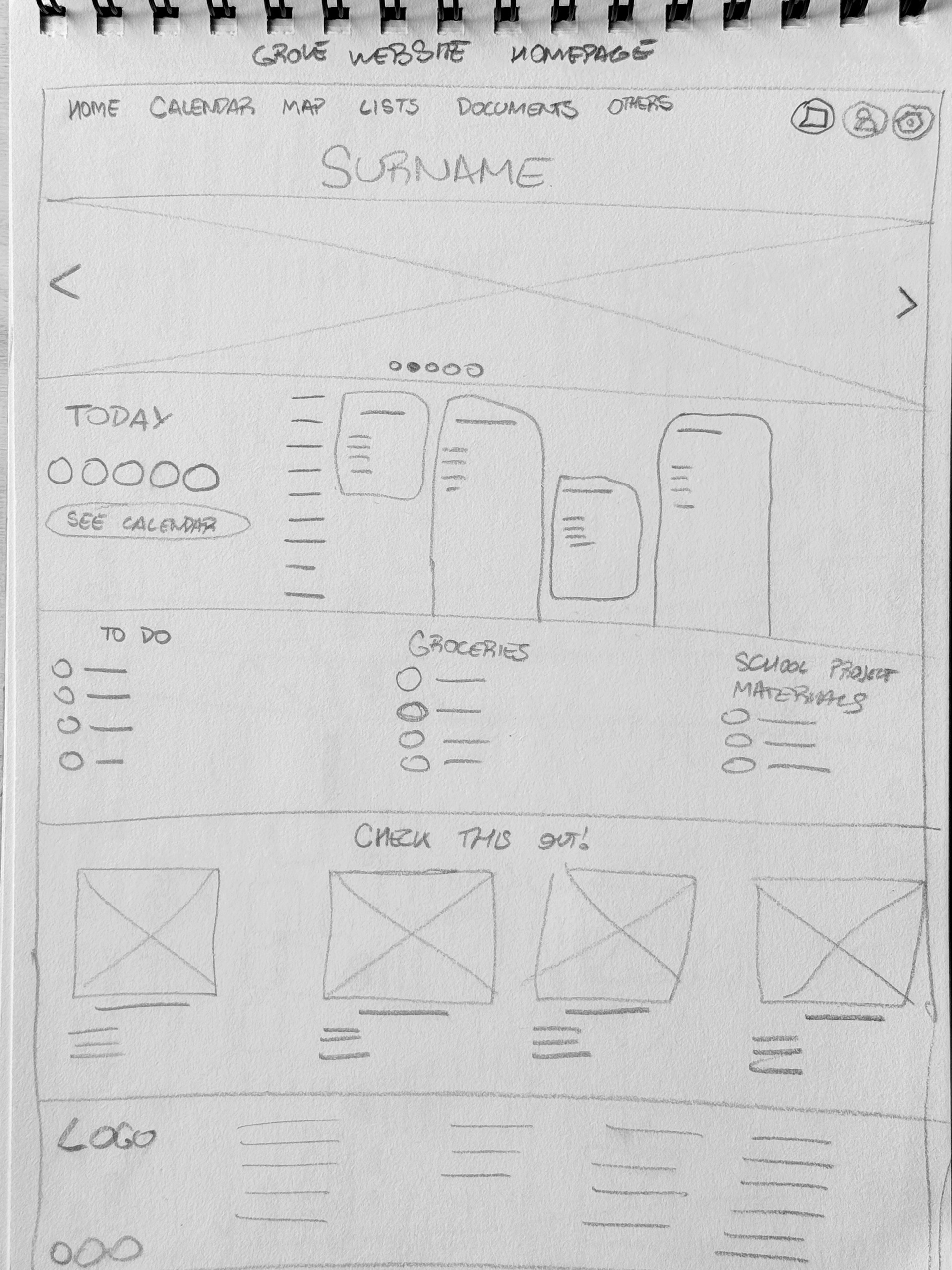
Z-SHAPED HOME SCREEN LAYOUT
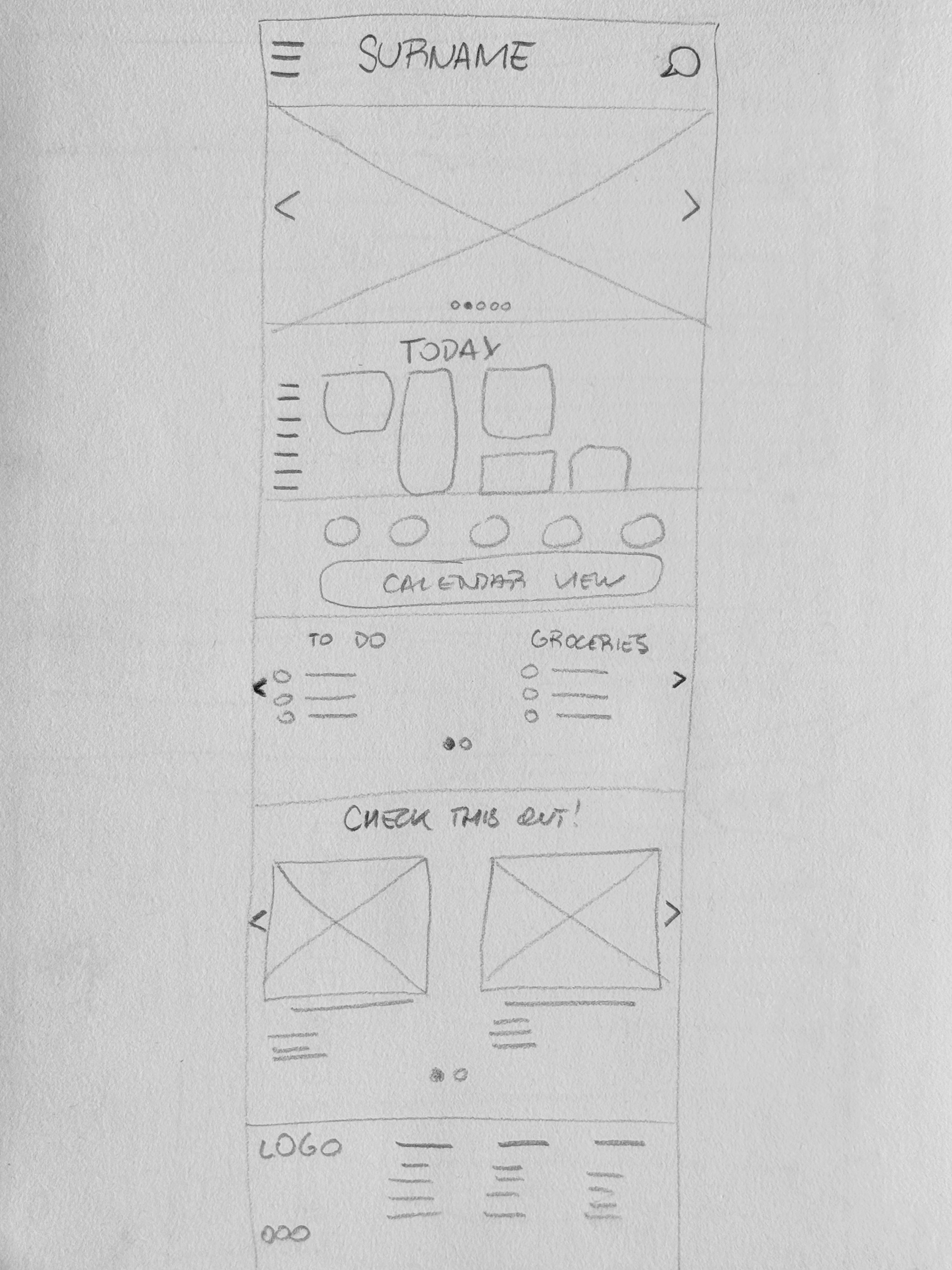
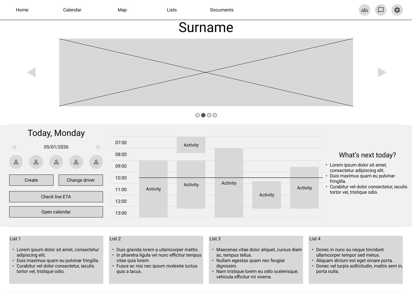
The home screen follows a Z-pattern layout to guide the user's eye naturally across the page.
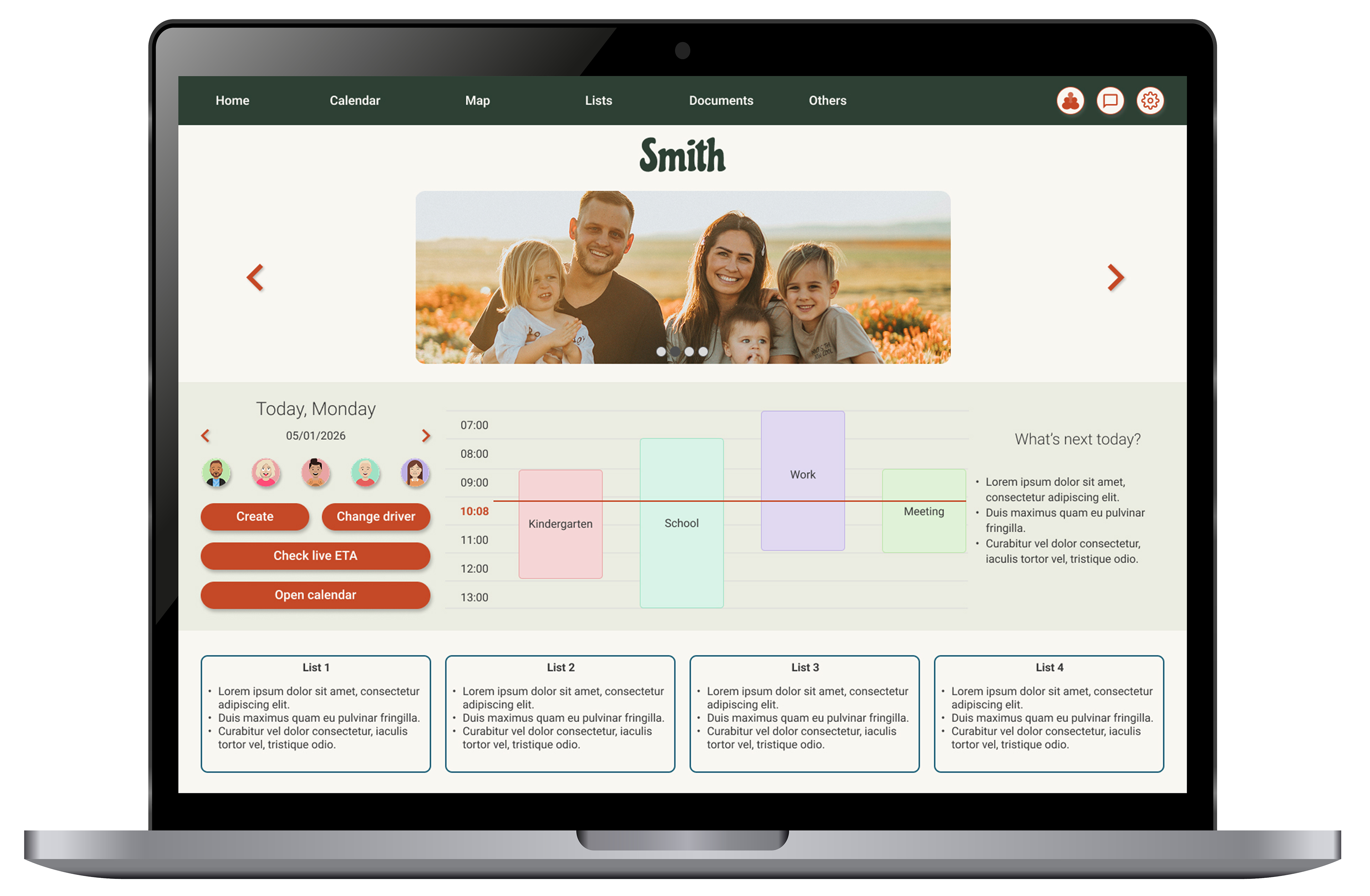
Above the fold: a full-width photo carousel to create an engaging, warm first impression, followed by a schedule view with contextual CTAs, add an event, modify a driver, check live ETA, open the full calendar, or tap into a specific activity. Three quick-access lists sit alongside, keeping the most relevant information front and center.
A PERSONALIZED FEED
Below the fold, a curated content section surfaces relevant articles, recipes, local activities, camps, and ideas. All pulled from external sources and filtered by the family's own interests and preferences. It's a small but meaningful addition that turns the website from a management tool into something families might actually enjoy browsing together.
Designed to work in every situation
While the Grove mobile app is the primary way to experience the product, built for the on-the-go moments that make up most of family life, the website was designed to be fully responsive, adapting its layout and features to fit any device it's opened on, from a large desktop monitor down to a tablet or mobile browser.
This wasn't just a technical consideration. It was a deliberate design decision rooted in accessibility and flexibility. Not every family member will download the app, and not every moment calls for it. The responsive website gives users one more way to stay connected to their family's schedule, lists, and communications, on their own terms, on whatever device they have at that moment.
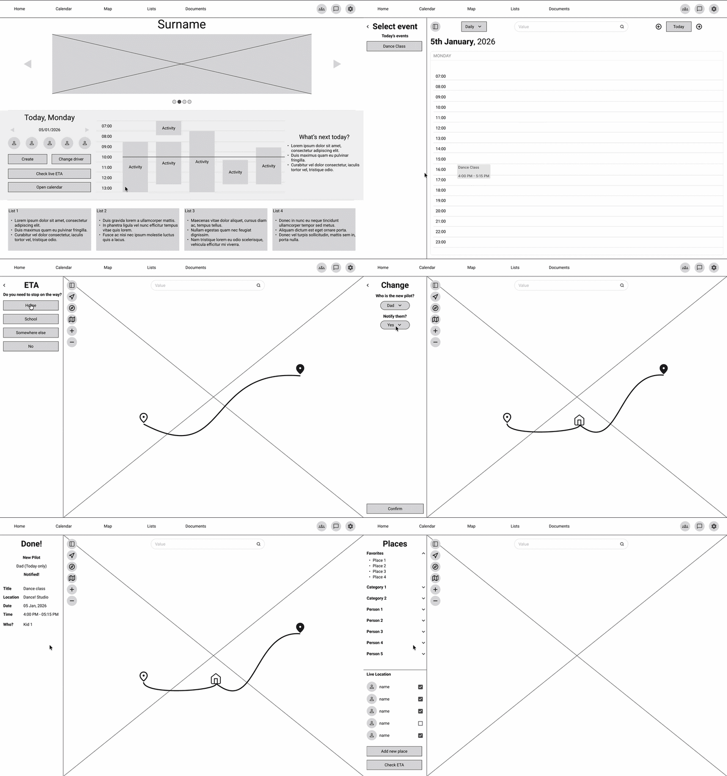
Try out the Lo-Fi prototype here!
The website's design kit is rooted in the same visual foundation as the Grove mobile app, sharing the same color palette, typography, and component styles to ensure a consistent experience across both platforms.
Where it differs is in how those elements are applied. Spacing, layout proportions, and certain components were intentionally adjusted to feel at home on a desktop screen, making the most of the wider canvas while keeping the familiar, approachable look that makes Grove work for the whole family.
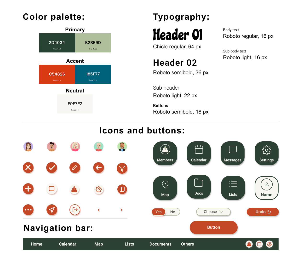
Grove's design kit
THE OUTCOME
The responsive website extends Grove's core experience into a desktop environment that feels spacious but never overwhelming.
The persistent navigation, open information architecture, and Z-pattern layout work together to make the experience intuitive from the first visit, while the personalized content feed adds a layer of discovery that the mobile app doesn't offer.
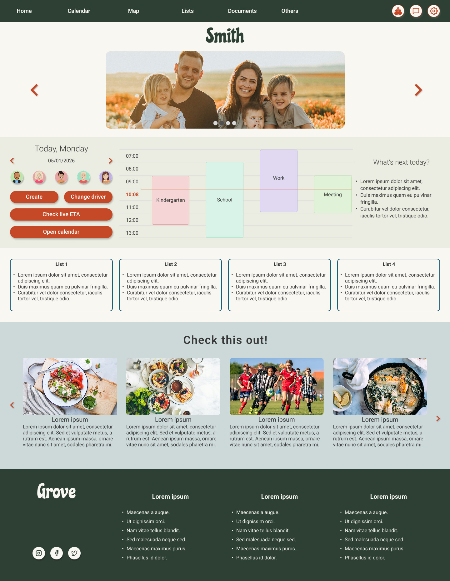
home screen
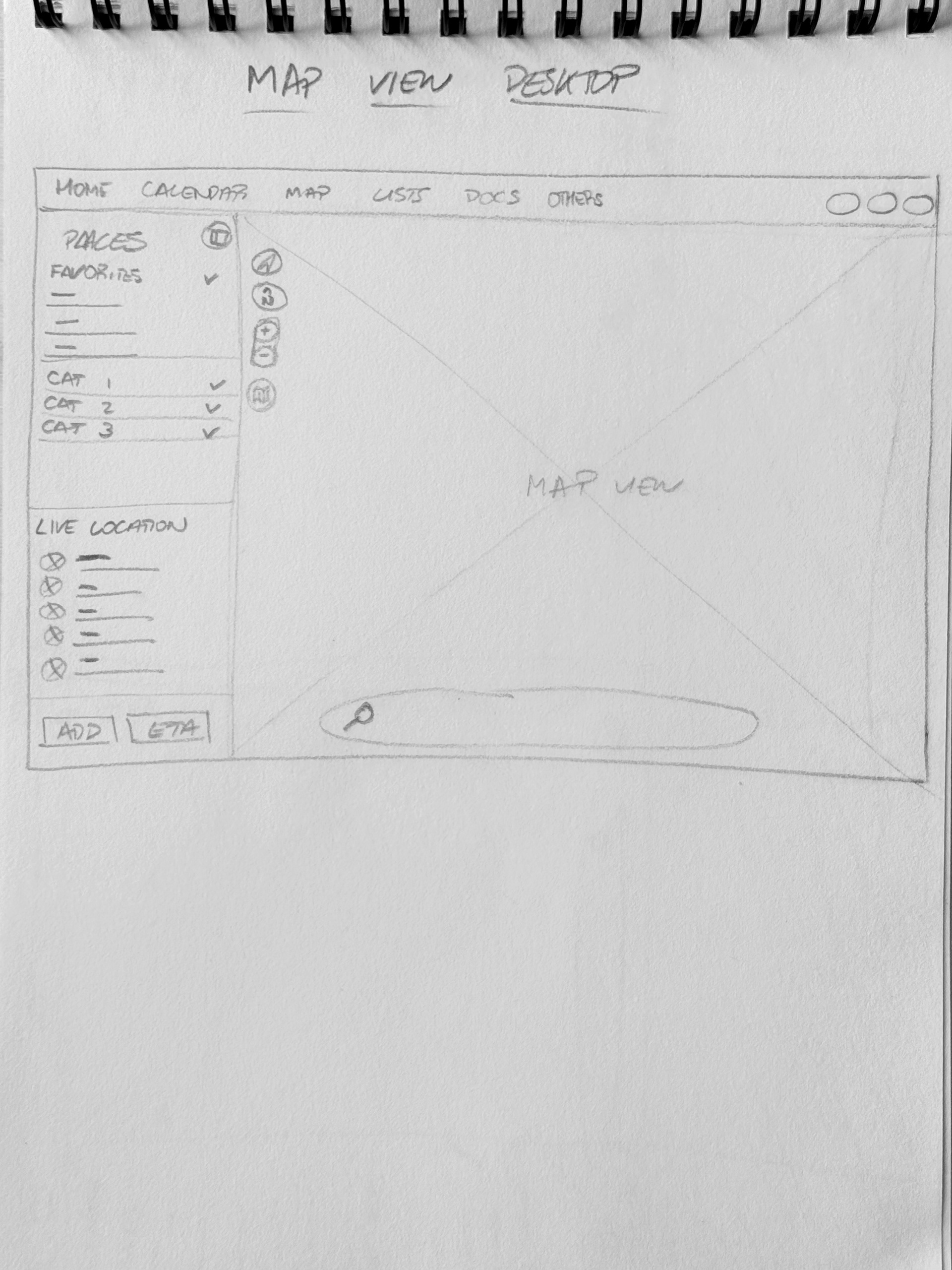
The desktop map view takes full advantage of a larger screen to give you a richer, more spacious look at what's happening around you. See your family members' live locations at a glance, while browsing a variety of categories, from nearby activities and recommended spots to places relevant to your family's interests, all displayed on the map at the same time. No switching between views, no hunting through menus. Everything you need to plan, coordinate, and stay connected is right there, laid out across your city's map in a way that simply isn't possible on a smaller screen.
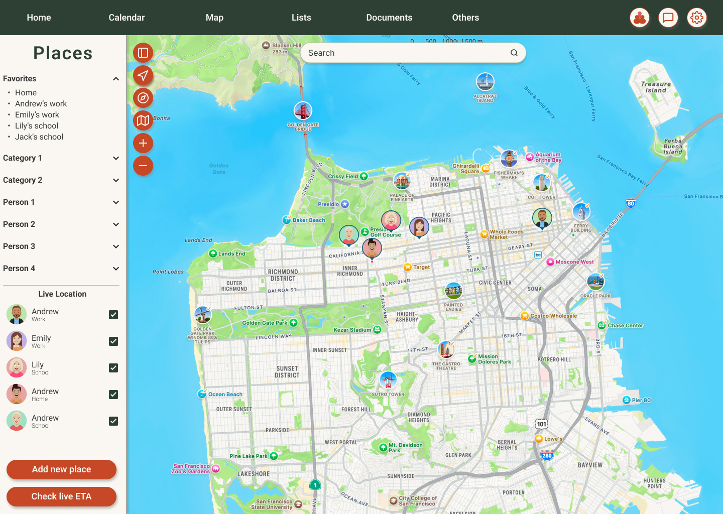
map view

Try out the Hi-Fi prototype here!
TAKEAWAYS
IMPACT
By making Grove available as a responsive website, the product becomes more accessible to a wider range of users, including those who prefer not to download an app or who simply find themselves at a laptop when they need to check the family schedule. The flexibility to access the same core experience across any device removes a barrier that might otherwise exclude certain family members, making the product genuinely more inclusive and useful for the whole family.
LEARNINGS
Adapting a mobile-first design to larger screens taught me that more space doesn't mean more content; it means making smarter decisions about what to prioritize and how to present it. I learned how to use desktop layouts to surface more information without creating visual noise, and how to apply responsive patterns thoughtfully: using a hamburger menu to keep smaller screen navigation clean, leaning on photo carousels to create engagement without overwhelming the layout, and using cards to organize content in a way that scales naturally across breakpoints.
NEXT STEPS
The website won't evolve in isolation. As the Grove app is reviewed and updated on a regular cycle, those changes will be reflected in the website in an integral way, keeping both platforms consistent and aligned at every step. The goal is for users to move seamlessly between the app and the website, always finding a familiar, up-to-date experience whichever way they choose to engage.
ADDITIONAL LINKS
In case you want to know the full research, designing, and prototyping process, feel free to check the full case study slides presentation.
Click here!
This project was developed as part of the Google UX Design Certificate on Coursera, following industry-standard design thinking methodology. The designated mobile app, on which this project is based, is showcased as a separate page.