INTRODUCTION
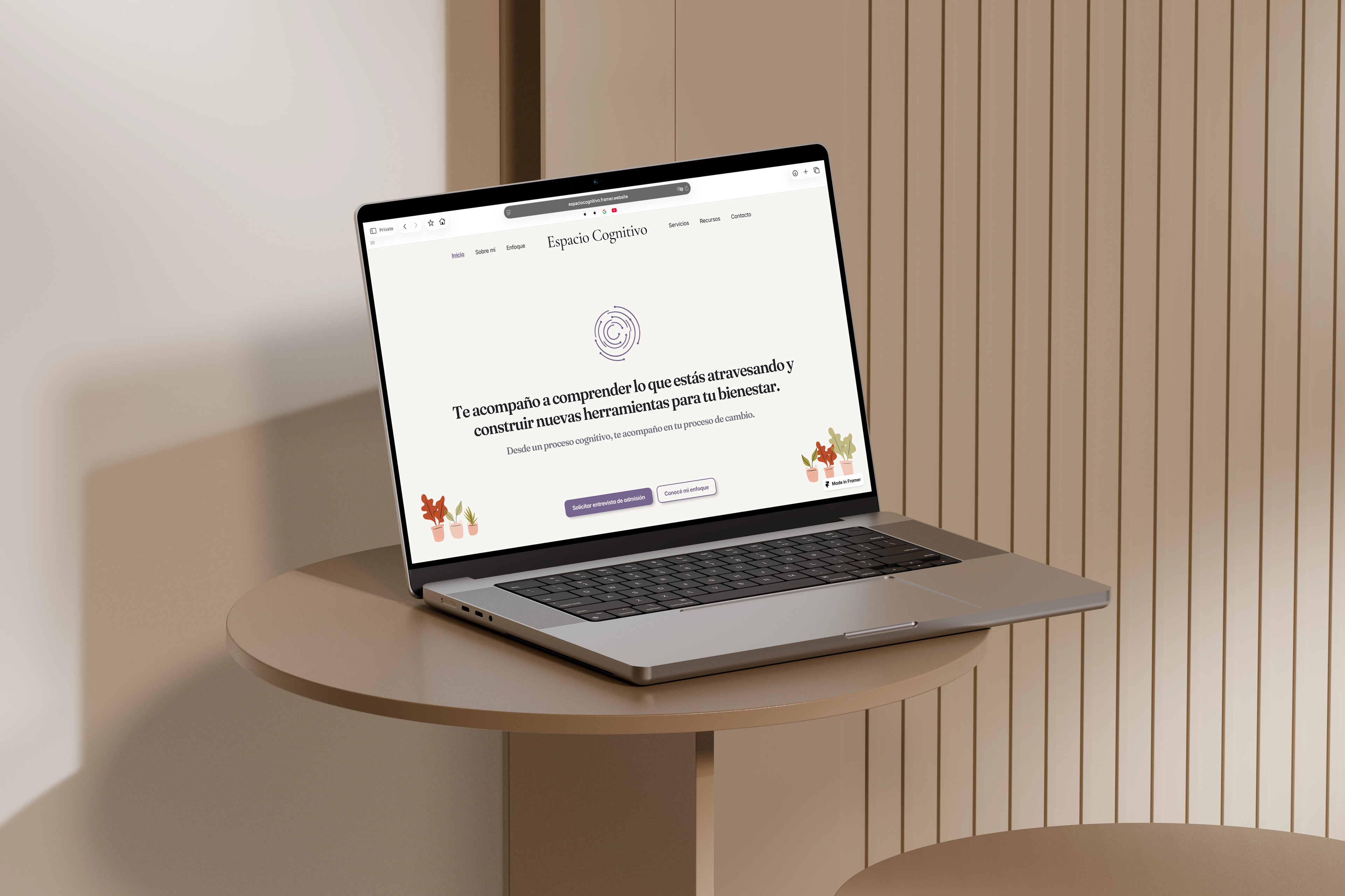
Espacio Cognitivo is the professional website of Caterina Biondini, a psychologist based in Córdoba, Argentina, specialising in Cognitive Behavioral Therapy. The project began as a professional web presence and evolved into a complete personal digital brand: a warm, evidence-based online space designed to reduce the emotional and informational friction involved in starting therapy.
MY ROLE
Role
UX & UI Designer, Framer Developer
Responsibilities
Discovery, content strategy, information architecture, brand direction, UI design, Framer development, UX/UI QA
Methodology
Understand → Structure → Design → Build → Review → Launch
Tools
Figma, Framer, Adobe Photoshop
OVERVIEW
Espacio Cognitivo is a complete end-to-end web project for a psychology practice in Córdoba, Argentina. Unlike most of my projects, this one started from zero. No existing website, no established brand, no defined content strategy. Everything was built from the ground up, from the first discovery conversation with Caterina through to a live, published Framer website with a custom CMS, integrated contact forms and CTAs, and a full design system.
The project is also the first completed under Robledo Studio, my independent freelance practice, and represents the most comprehensive work I've done to date: combining UX strategy, brand direction, content writing, UI design, and front-end development into a single cohesive outcome.
CHALLENGE
Most psychology websites fall into one of two traps: they either feel too clinical and institutional, or too generic wellness-oriented, full of leaves, zen circles, and motivational quotes. Neither builds the kind of trust that makes a potential patient feel comfortable enough to reach out.
The real challenge wasn't just designing a website. It was designing an experience that answered the questions a first-time therapy seeker actually has: Am I in the right place? Who would I be talking to? What happens if I contact her? The goal was to make starting therapy feel less uncertain, and Caterina feel genuinely human and credible at the same time.
RESEARCH
The project started with a discovery phase: client interviews to understand Caterina's practice, her patients, her values, and what she needed the website to communicate. A competitive audit of existing psychology websites in the region helped identify what to avoid and where to differentiate.
The core strategic principle that emerged was: understand before designing, explain before convincing. For a psychology practice, reducing uncertainty and establishing trust matter more than traditional sales-oriented persuasion. Every design decision that followed was informed by that principle.
DESIGN PROCESS
UX DECISIONS
The homepage was designed as a deliberate sequence, not a collection of sections. Each block answers a specific question a potential patient has when they arrive for the first time, in the order they naturally ask them.
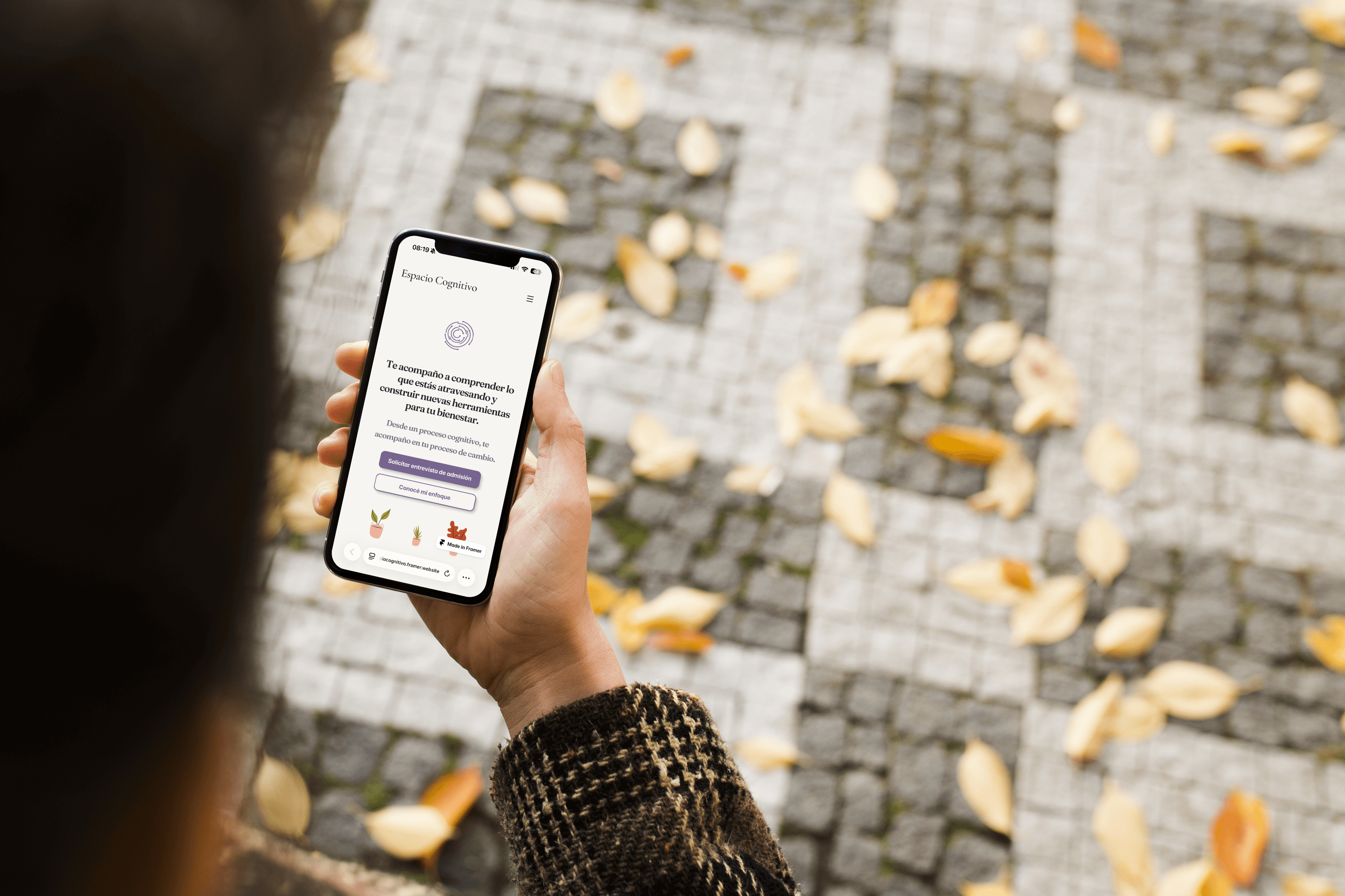
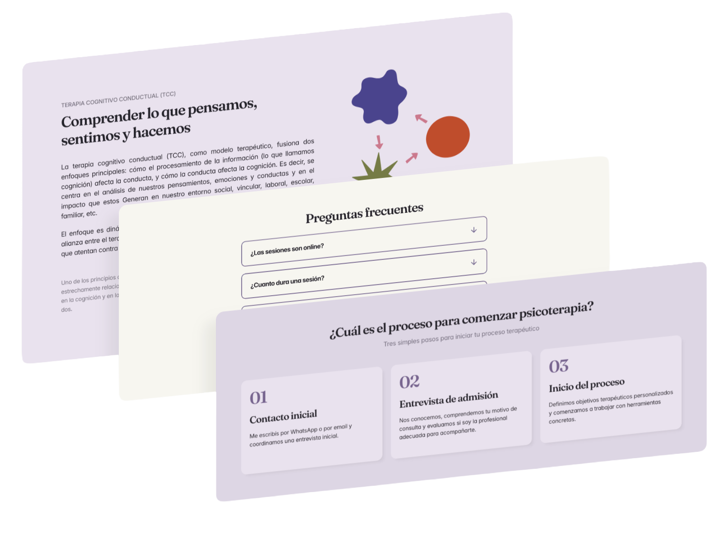
The hero answers "Am I in the right place?" with a direct, warm headline and a clear primary CTA. The About preview answers "Who would I be talking to?" before the visitor has had to go looking. The Services section gives a high-level sense of what's available, with intentionally short summaries and CTAs that redirect to the full Services page, where each offering is explained in depth through the dynamic selector. The three-step process section exists specifically to reduce the anxiety of starting therapy, making the path from first contact to first session feel predictable and manageable rather than unknown. The FAQ section was placed before the final conversion moment deliberately, to remove the last remaining friction before asking the visitor to take action.
Each page in the sitemap serves a distinct purpose in the overall journey. The homepage builds orientation and trust. Sobre mí builds personal connection. Enfoque builds credibility and understanding of the therapeutic model. Servicios gives the visitor everything they need to make a decision. Recursos reinforces Caterina's evidence-based positioning over time. Contacto removes every possible barrier between the visitor and a first conversation.
The CTAs throughout the site reflect this structure. Rather than using a single generic button everywhere, each CTA is contextual: the primary action across most of the site is requesting an admission interview, but service-specific pages use their own CTAs, and the Resources section directs visitors outward to external articles. The goal was a system that always gives the visitor a clear, appropriate next step without feeling pushy or repetitive.
The final sitemap is deliberately simple and user-oriented:
Inicio · Sobre mí · Enfoque · Servicios · Recursos · Contacto
Homepage · About me · Perspective · Services · Resources · Contact
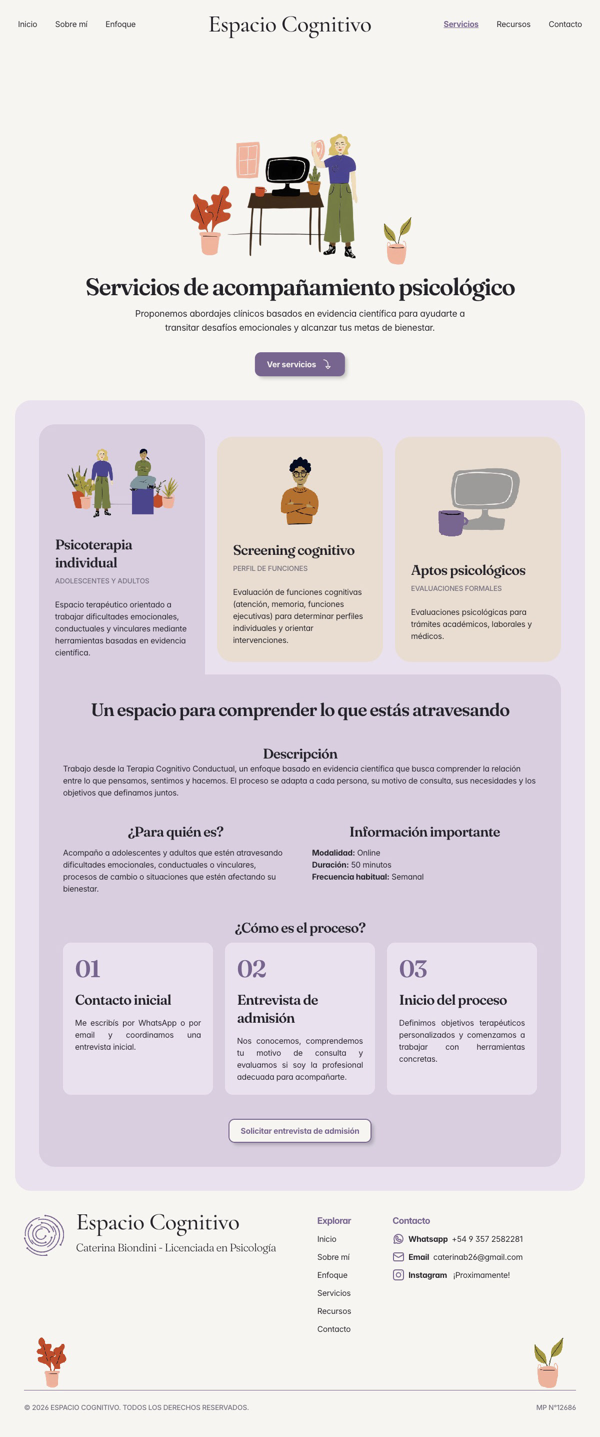
Services live on a single page with a dynamic card-selector pattern, allowing users to switch between the three services (Psicoterapia individual, Screening cognitivo, Aptos psicológicos) without navigating away. This keeps orientation clear and reduces unnecessary page transitions.
The agreed brand personality sits in a specific middle ground: warm, calm, professional, and evidence-based. Human enough to feel approachable, scientific enough to feel credible. The visual identity needed to avoid both the cold institutional look of a medical website and the generic softness of wellness branding.
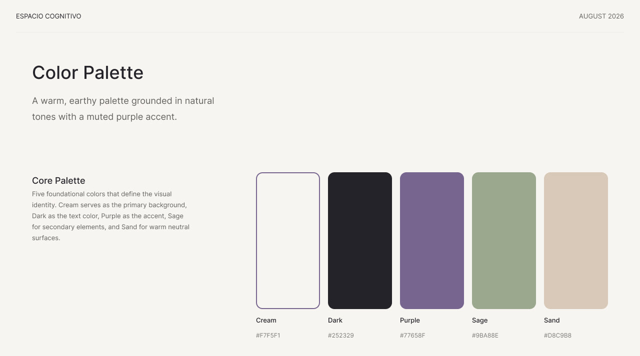
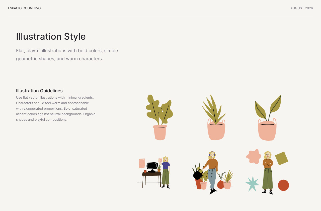
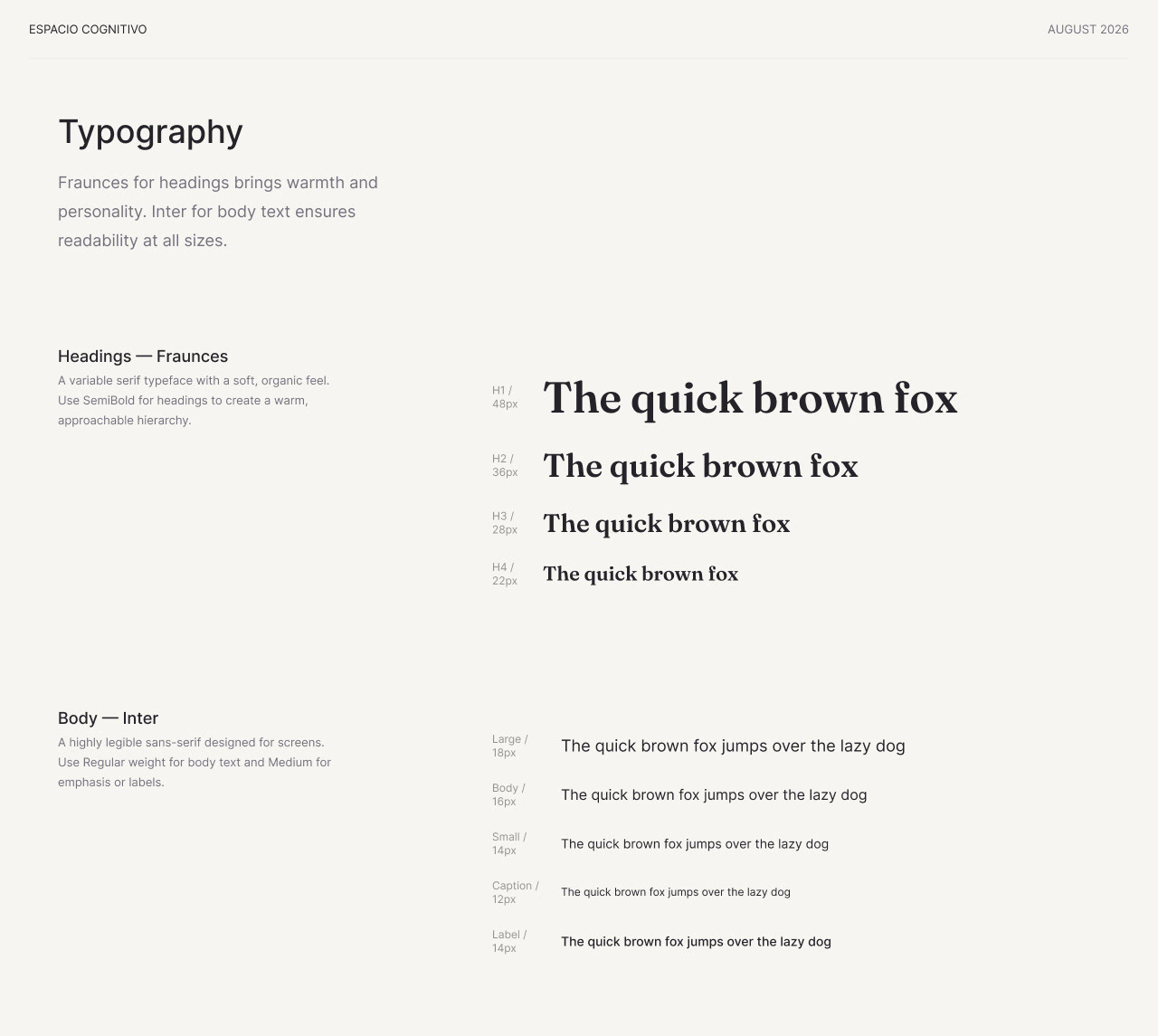
The solution was a palette of warm ivory, plum, sage green, and sand tones, paired with Fraunces for headings (warm, editorial, and friendly) and Inter for body and UI (legible and professional). The strongest differentiator was the use of custom illustrations in the Blush People of Brooklyn style: friendly, imperfect, and human, rather than SaaS-polished or medical.
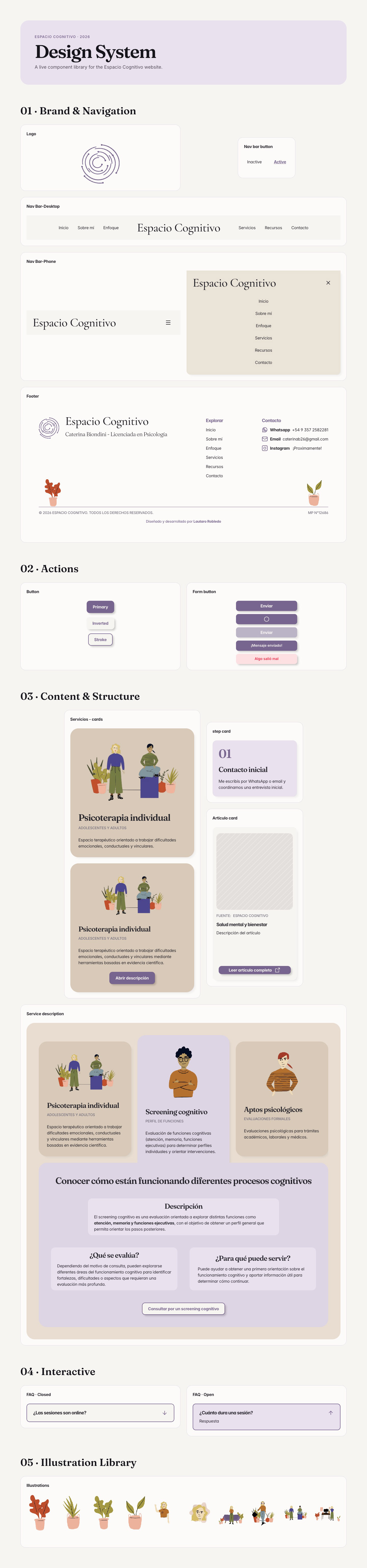
The component library was built for consistency and client handoff. Key components include navigation (desktop and mobile), service cards, a dynamic service selector, resource cards, FAQ accordion, CTA sections, contact cards, form fields, and process cards. Color, typography, spacing, border radius, and shadow tokens were defined to keep the Framer build consistent throughout.
PAGE BY PAGE
HOMEPAGE
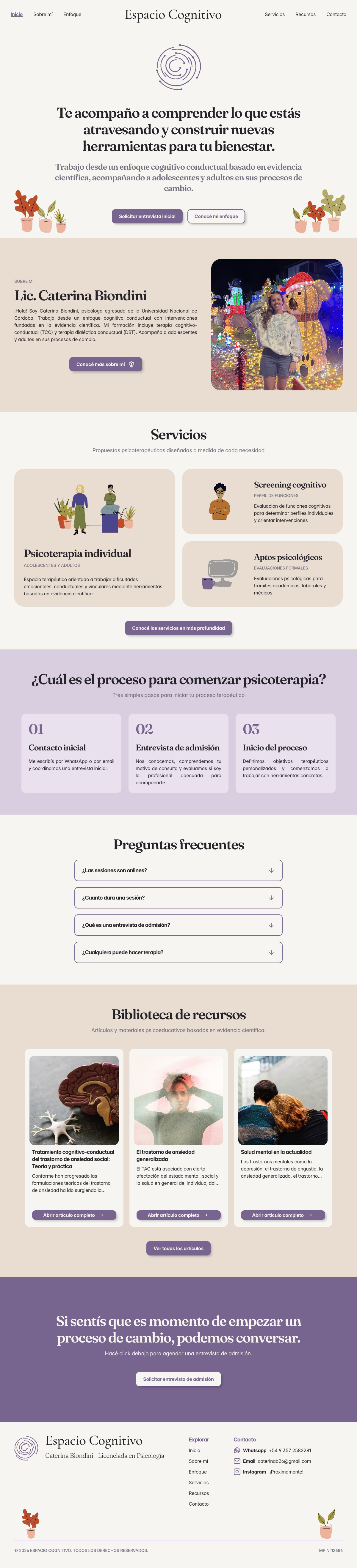
The homepage tells a deliberate story structured around the questions a potential patient asks when they arrive. The hero answers "Am I in the right place?" with a warm, direct headline and a primary CTA to request an admission interview. The About preview answers "Who would I be talking to?" A three-step process section reduces anxiety by making the path to starting therapy feel predictable and manageable. An FAQ section removes friction before the final conversion section, which uses a deep plum background to signal the closing call to action clearly.
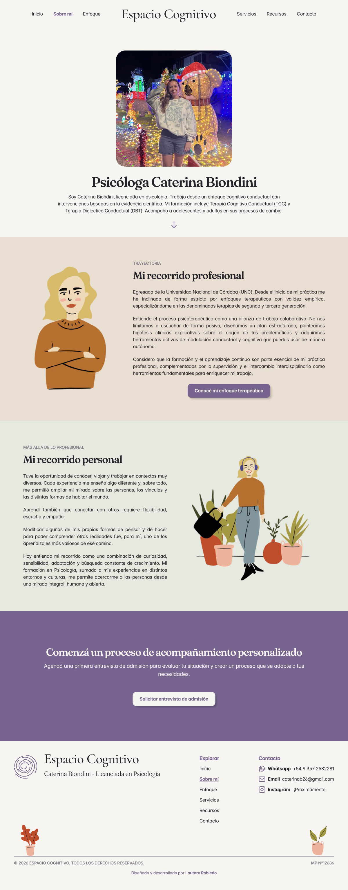
SOBRE Mí (about me)
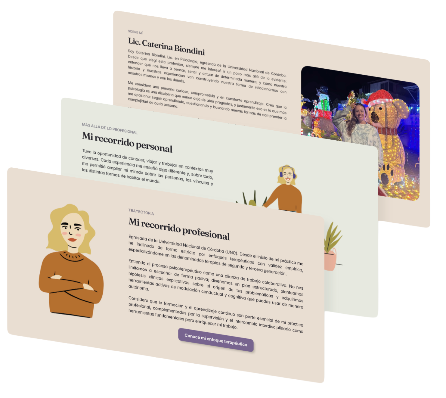
Designed to build connection and trust in Caterina as both a person and a professional. Structured around her professional background and a personal section that lets visitors know her beyond her qualifications.
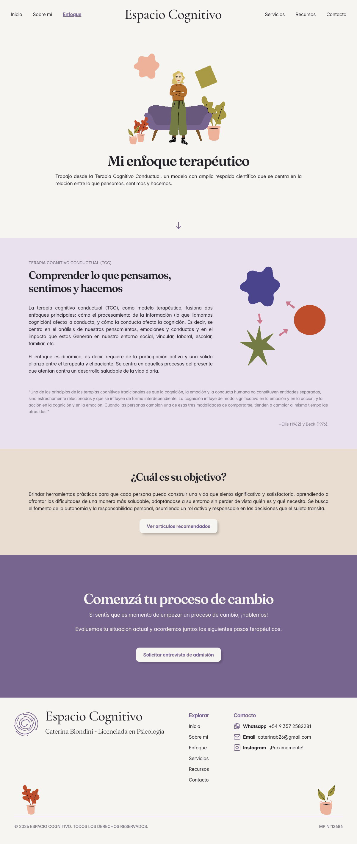
ENFOQUE (perspective)
An educational page explaining Cognitive Behavioral Therapy, the core framework of Caterina's practice. Built around the relationship between thoughts, emotions, and behaviors, framed accessibly without losing scientific credibility.
SERVICIOS (services)
A single page with three services displayed through a dynamic selector. Each service card on the homepage shows a short summary, with full details living on the Services page.
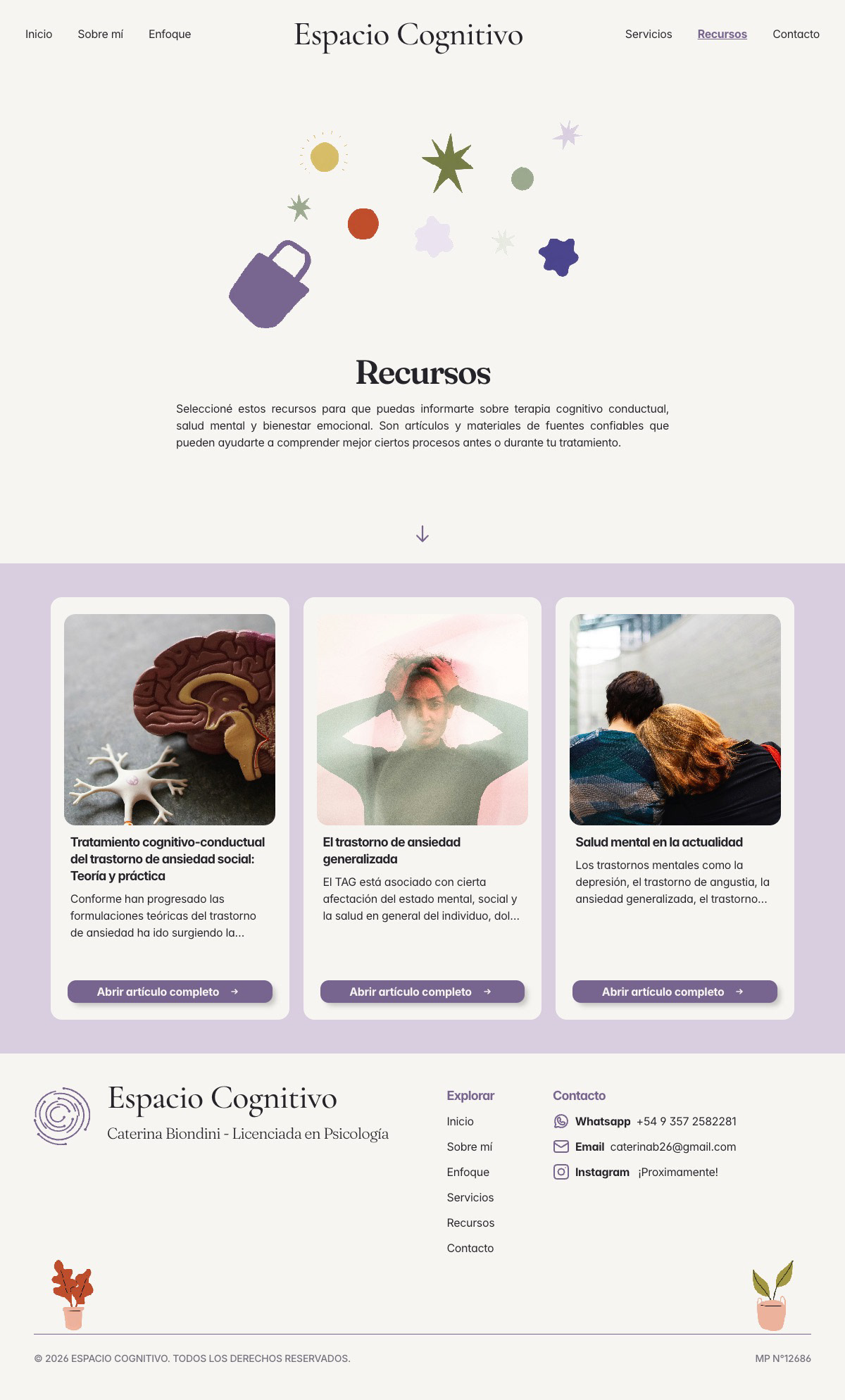
RECURSOS (resources)
A curated library of external evidence-based articles and resources, positioned as educational material rather than a blog. Each card shows the source and publication rather than only the author name, reinforcing Caterina's evidence-based positioning.
CONTACTO (contact)
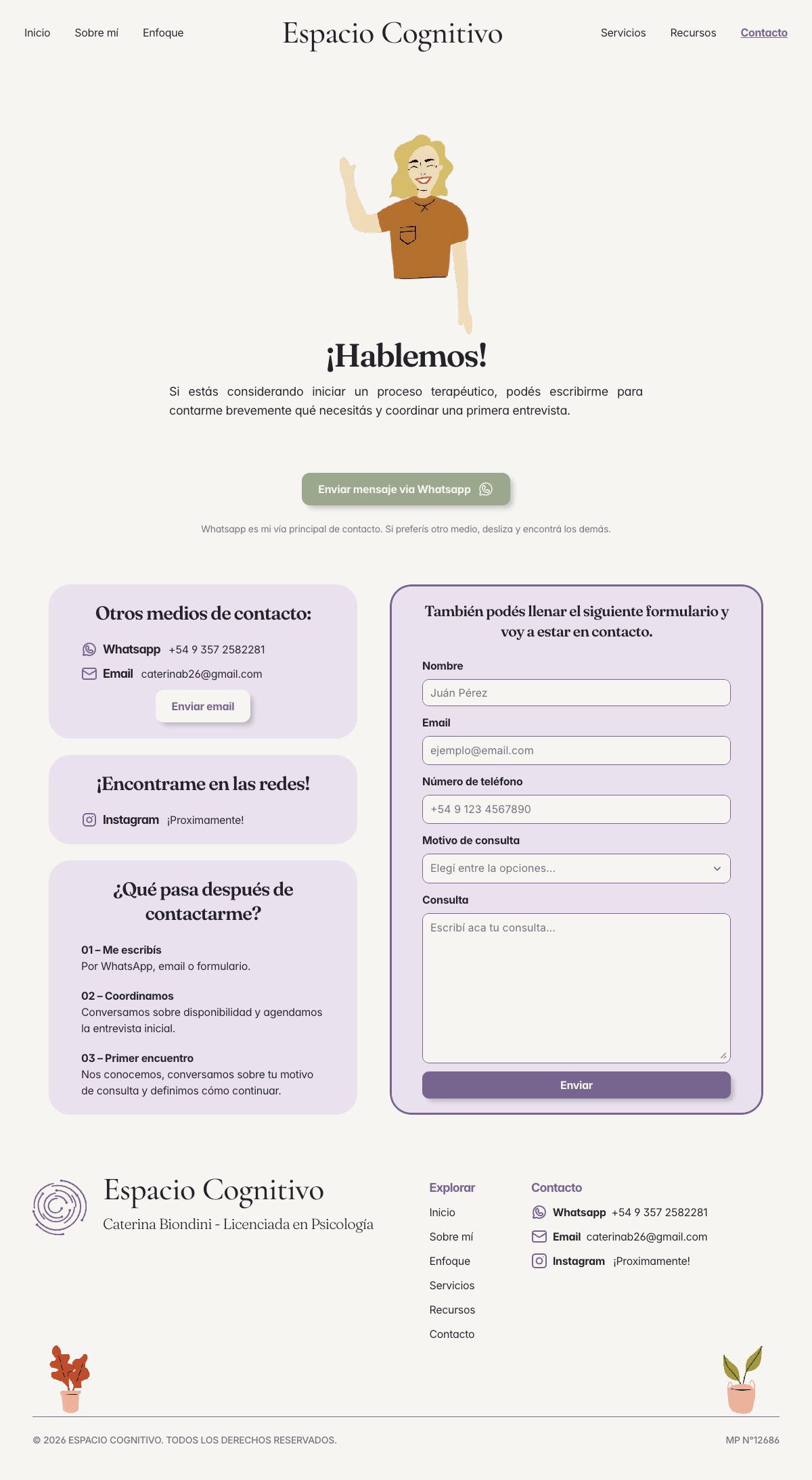
WhatsApp is the primary contact channel and dominates the visual hierarchy of the page. The contact form, email, and address are available as secondary options. Context-specific WhatsApp links with pre-filled messages were created for each service type, reducing friction at the point of contact.
Development
Taking it live — development in Framer
The full website was built end-to-end in Framer, translating the Figma designs into a live, published site. The dynamic service selector was implemented as a custom interactive component. A custom CMS was configured for the Resources section, allowing Caterina to add and update resource cards independently, as well as the FAQs. Context-specific WhatsApp links with pre-filled consultation messages were integrated across the site. Three contact forms were implemented across different contexts. A custom branded 404 page was designed and built to match the visual identity.
LIVE WEBSITE
TAKEAWAYS
IMPACT
For a psychology practice, trust is the product. Every design decision, from the illustration style to the FAQ placement to the three-step process section, was made in service of reducing the uncertainty that stops people from seeking help. A website that makes starting therapy feel less daunting is a website that genuinely makes a difference.
my learnings
This was my most complete project to date, spanning strategy, brand direction, content, UI design, and full Framer development. It pushed me to think beyond visual craft and consider the emotional journey of a user who is vulnerable, uncertain, and making a significant personal decision. It also reinforced how much value comes from a clear process: understanding the client and their users deeply before touching a single design tool.
NEXT STEPS
The site will be reviewed and updated as Caterina's practice evolves, including adding her final photography, expanding the Resources library over time, and integrating Instagram once her account is active. Any new services or content will follow the same design system and brand principles established during this project.