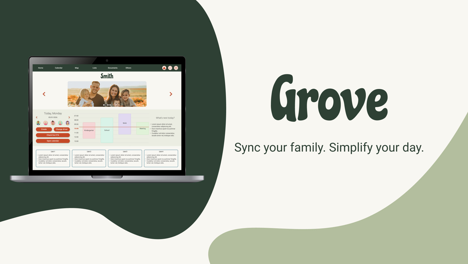
INTRODUCTION
Bringing family life into one place
Families today don't come in one shape, and neither do their schedules. Between co-parenting arrangements, after-school pickups, shared responsibilities with nannies or grandparents, and the constant back-and-forth of daily life, staying organized as a family is genuinely hard.
This project started with a simple observation: most families are already using a handful of apps to manage their lives, yet somehow still feel out of sync. I wanted to design something that brought everything together, not by adding more features, but by reducing the friction that makes coordination so exhausting.

MY ROLE
Role
UX & UI designer
Responsibilities
Research, ideation, prototyping, usability testing
Methodology
Design thinking
Tools
Figma
THE PROBLEM
At the beginning, it’s easy to fall into biases and assume that a family that needs a management app is what society sometimes makes us believe as the “typical family”. But in reality, there is no such thing. Modern families are busy, diverse, and spread across multiple apps. Whether you're co-parenting across two households, coordinating with a nanny, or keeping grandparents in the loop, staying on the same page is harder than it should be.
I ran online surveys and questionnaires with people across different family structures to understand real frustrations. The findings shaped a clear problem statement: families needed a single, accessible tool that could reduce friction and keep everyone, regardless of age or tech comfort, informed and organized.
The core pain points were clear:
MISCOMMUNICATION
Update last-minute changes, activity cancellations, or delays.
MULTIPLE TOOLS
The use of too many tools to schedule, coordinate, and communicate.
LIVE CIRCUMSTANCES
Know the live current travel time between parents’ workplaces, kids’ activities locations, and home.
SEASONAL ACTIVITIES
Sport, activities, and camp schedules change every season with multiple times and locations.
DESIGN PROCESS
From the beginning, I realized the main pain points required a dedicated mobile app that allows the user to act on the go. Then, I chose a progressive enhancement approach.
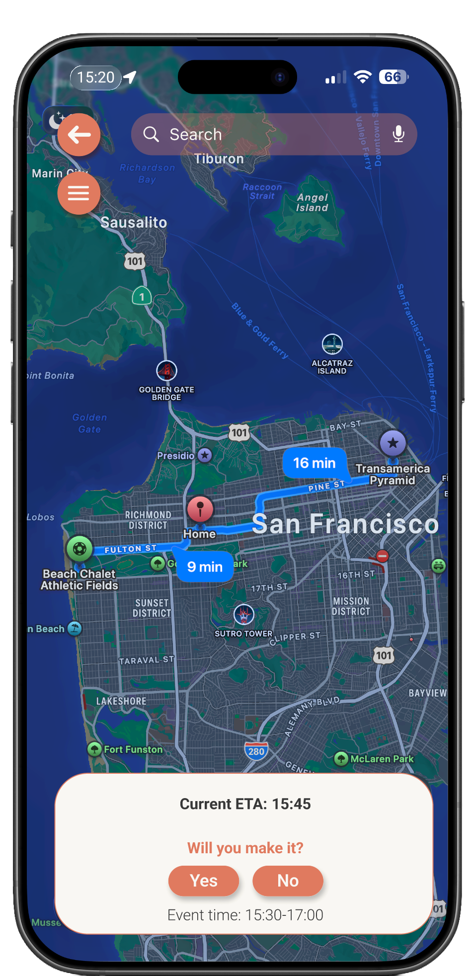
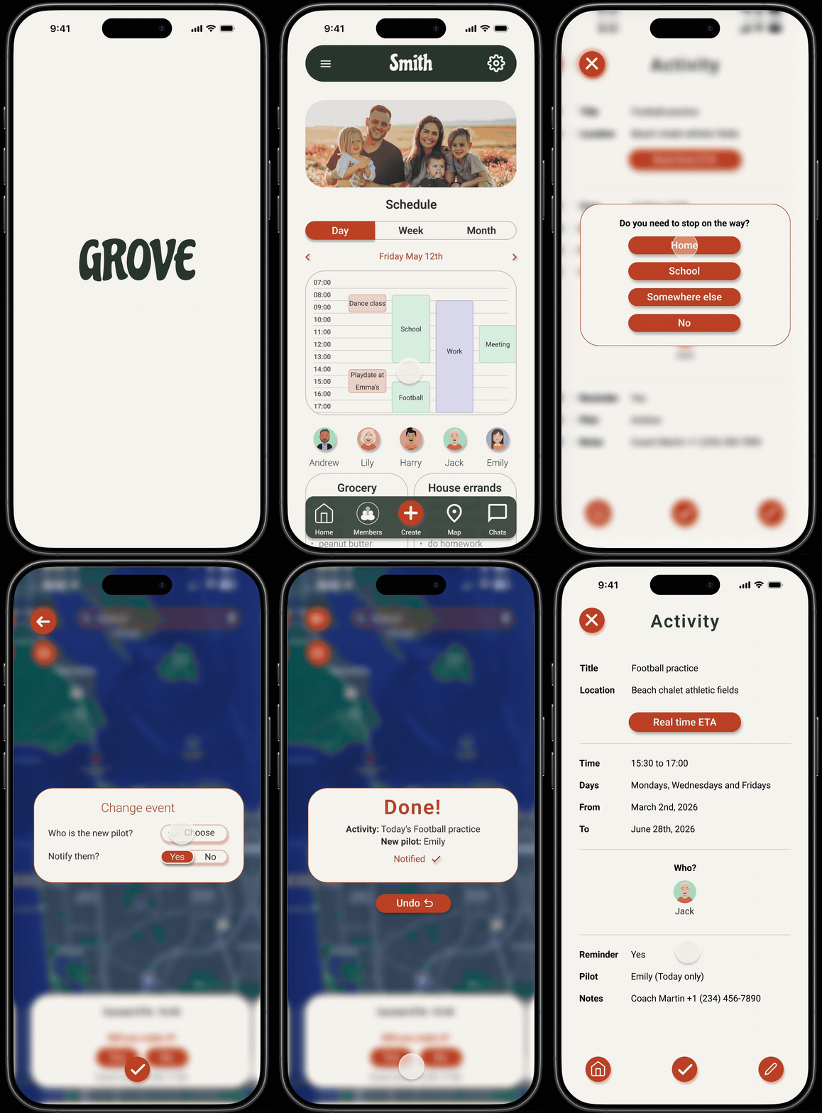
I focused on one core user flow first: managing family schedules on the go. This included a shared calendar, the ability to create and edit activities, live ETA tracking, the option to make a stop along a route, and instant messaging to communicate changes, all within an integrated map and messaging experience.
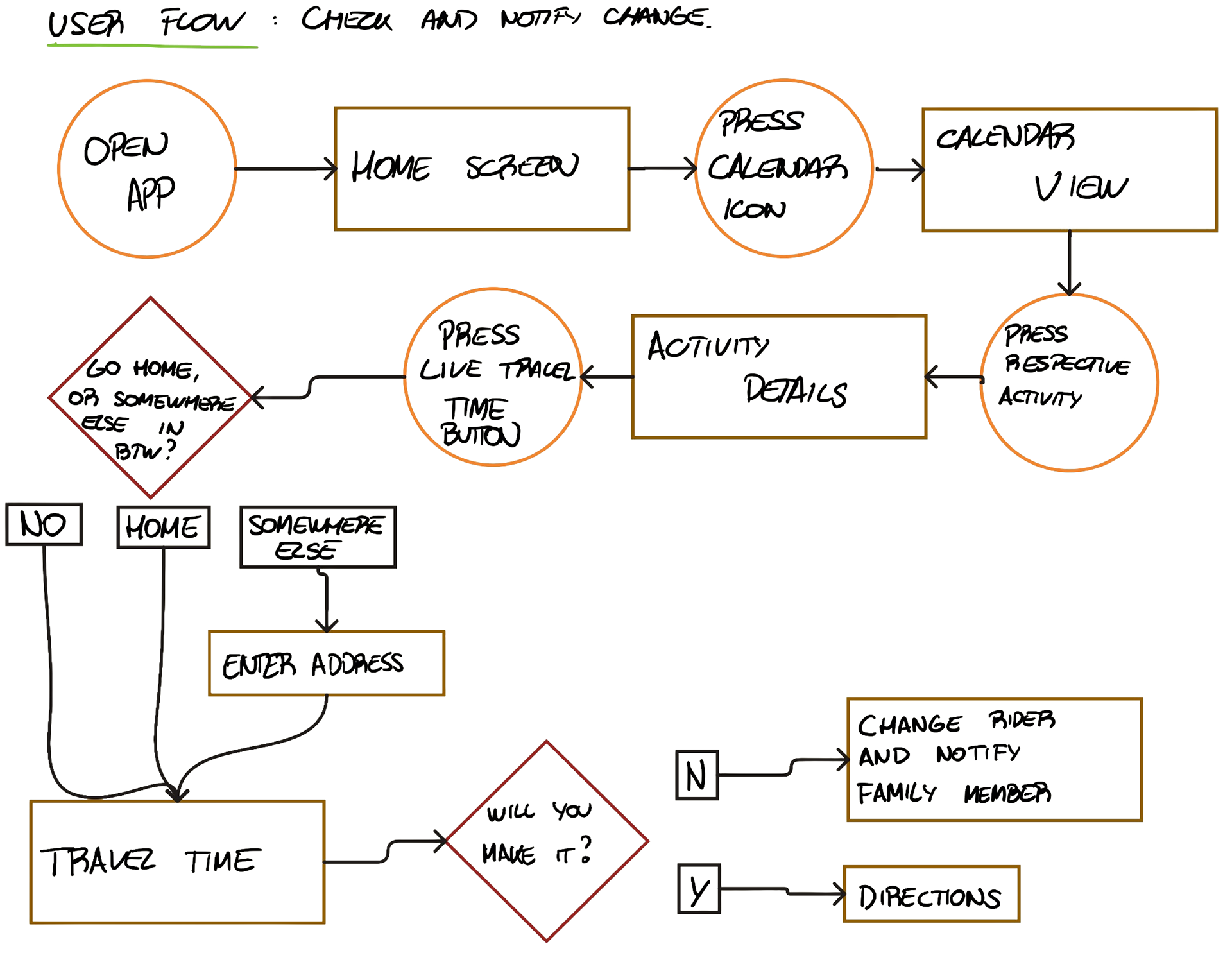
user flow - check live ETA and notify a change
From there, I expanded the design to include lists, document storage, and other useful features like recipes, keeping the interface clean and accessible for a wide age range.
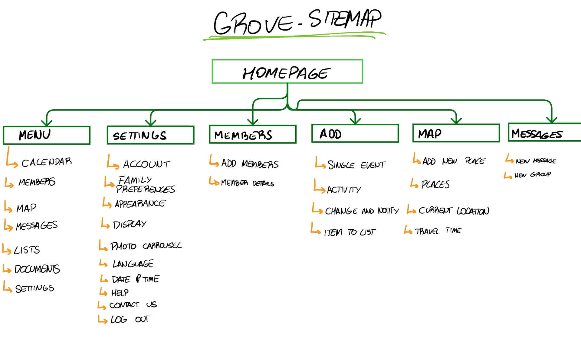
sitemap
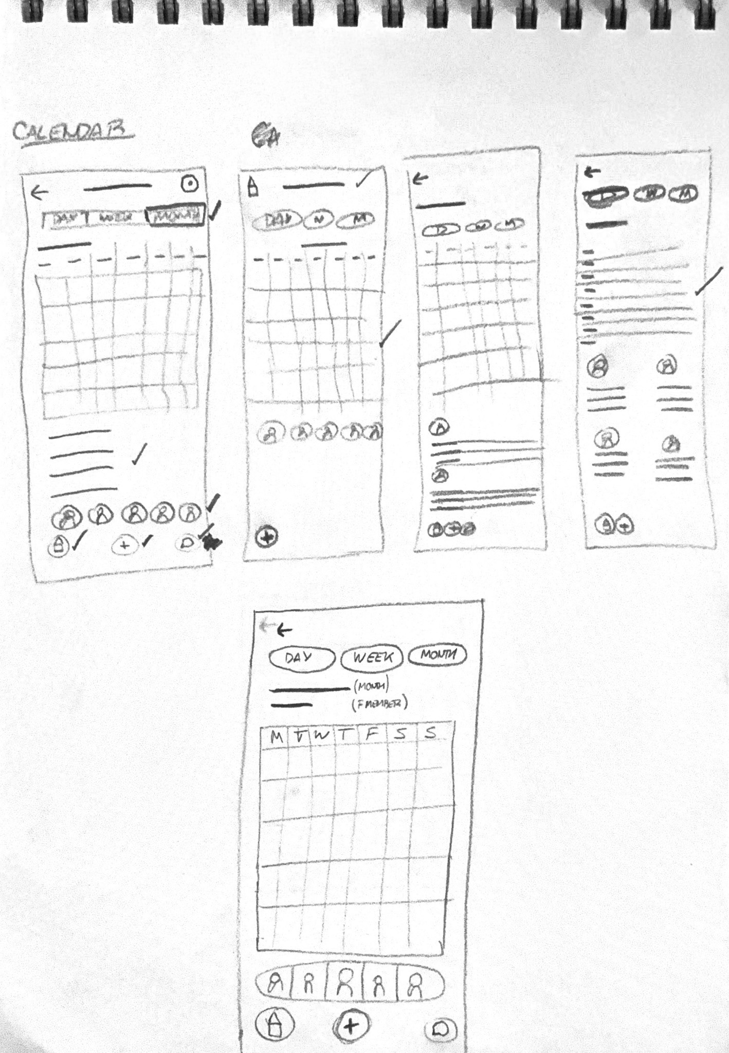
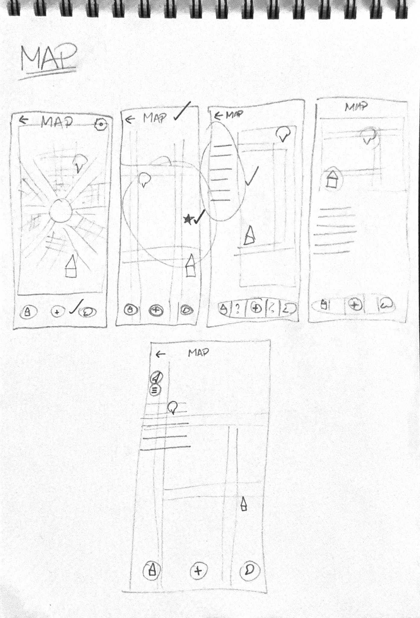
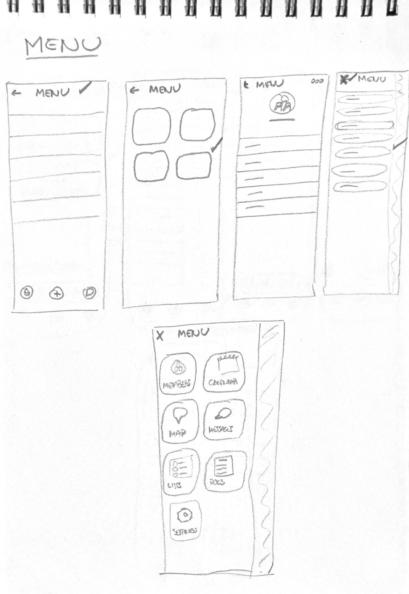
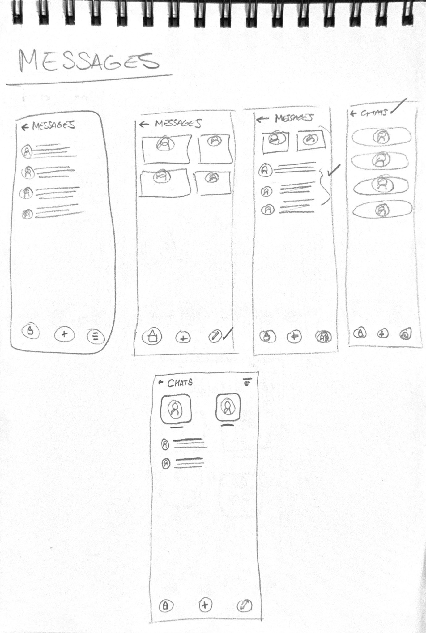
I conducted usability studies with real users to validate the functionality and user-centered approach on Lo-Fi prototypes. Their feedback guided iterations that kept the app focused: not too many menus, not too many options, just the right amount of structure to make family life feel manageable. It also found some key specific findings:
- The main 'add' button is not clear
- Confusing user flow to modify driver
- Missing information when creating events/activities
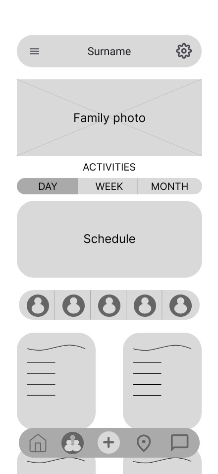
Homescreen
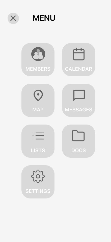
Fly-out menu
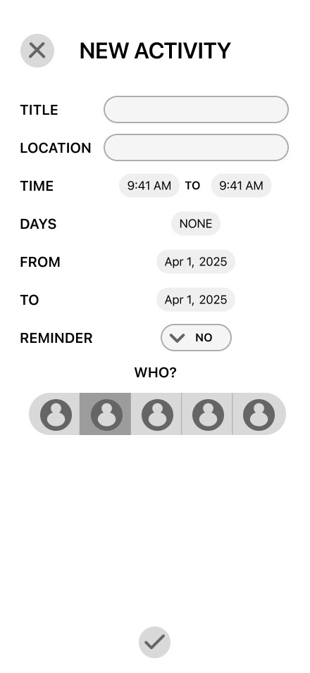
Recurrent activity creation
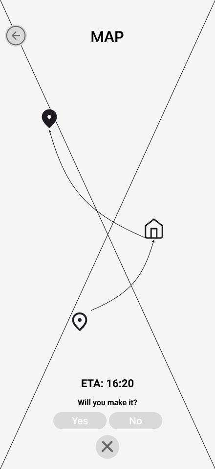
Live ETA check
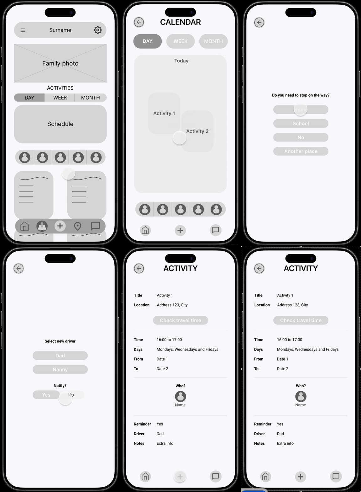
Try out the Lo-Fi prototype here!
Grove is meant to describe the family working as a whole in any environment, adapting to changes in it, and constantly collaborating with each other. The color palette was decided in direct relation to the name of the app, adapting complementary colors to align with accessibility standards.
After iterating with many options, overall simple functionality, and visual design principles, I developed the design kit used for the Hi-Fi designs.
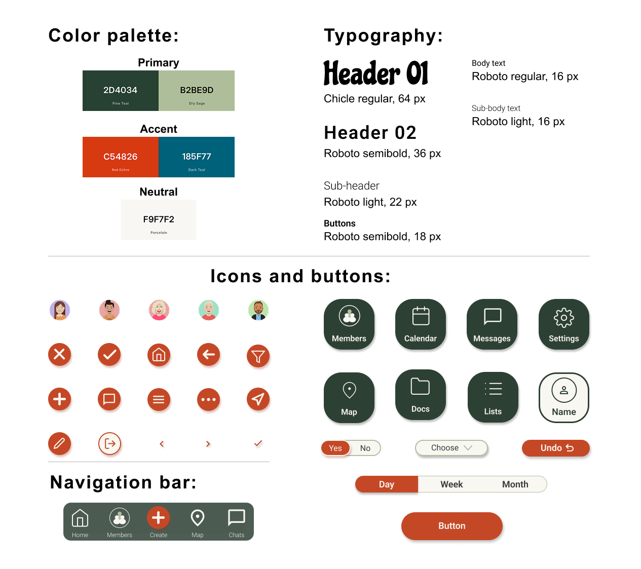
Grove's design kit
THE OUTCOME
After iterating based on the insights found with the usability study, the result is a family management app designed around how families actually live, not how we wish they did. It brings schedules, documents, to-do lists, maps, and messaging into one place, with an interface intentionally designed to work for everyone from teenagers to grandparents.
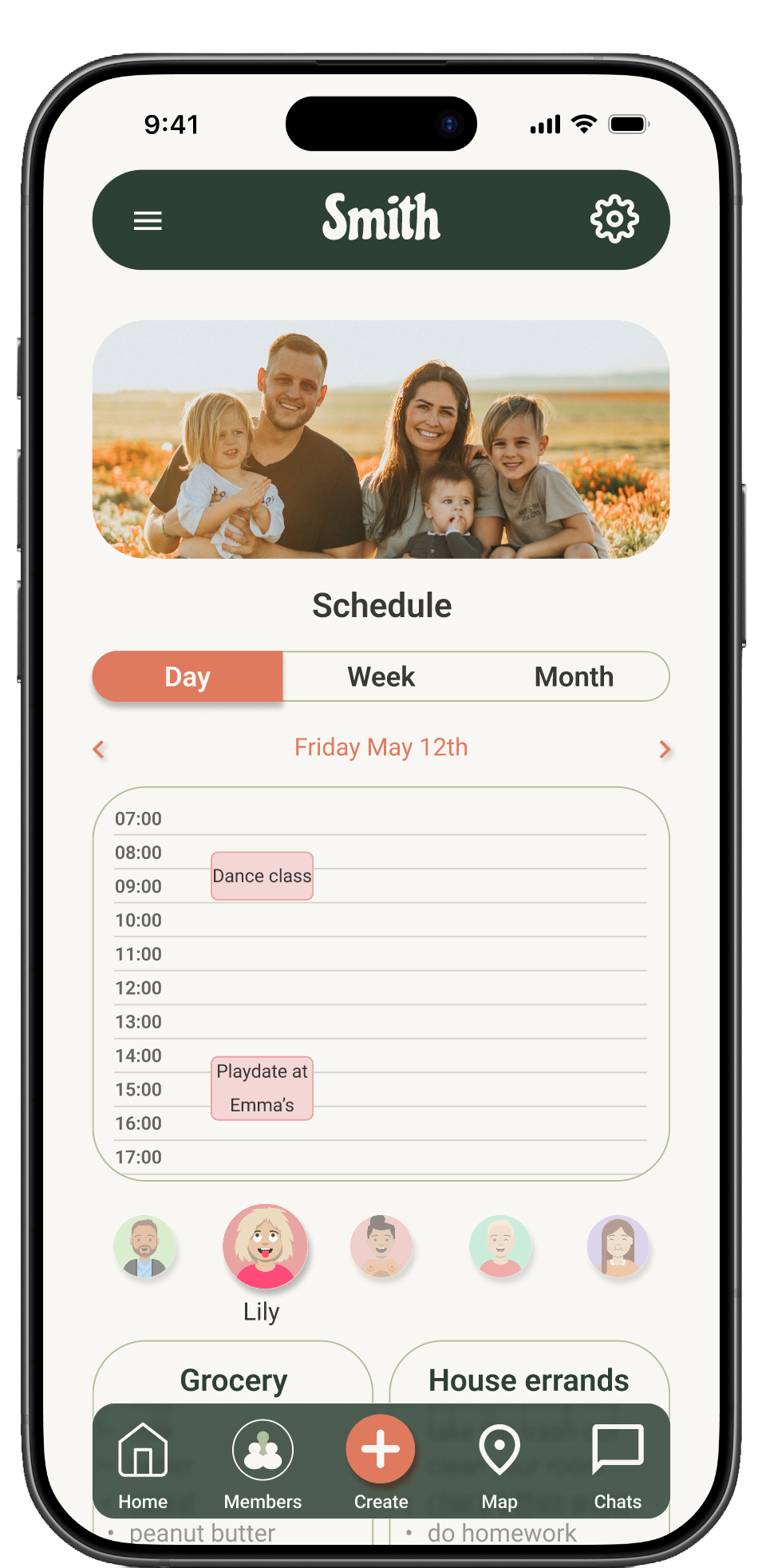
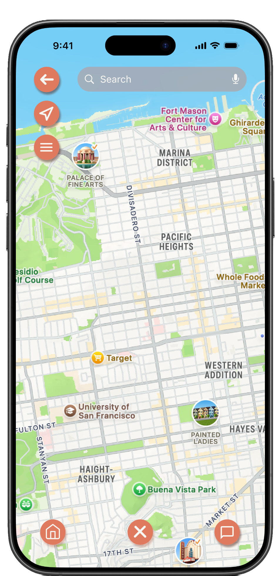
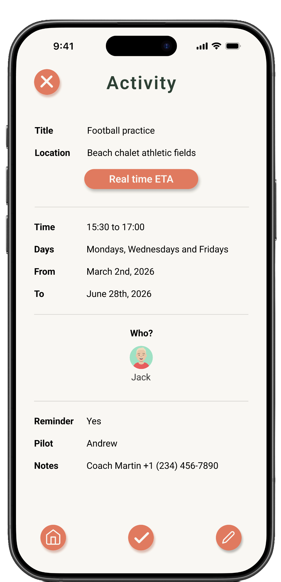
Try out the Hi-Fi prototype here!
TAKEAWAYS
IMPACT
Family coordination is a real, everyday problem. This project showed that thoughtful design can genuinely reduce that friction. By bringing schedules, communication, and documents into one accessible place, the app has the potential to give families back something valuable: a little less chaos, and a little more clarity and quality time together.
LEARNINGS
This project reinforced how important it is to stay focused. The temptation to keep adding features is real, but the most meaningful design decisions were the ones about what to leave out. I also learned that designing for a wide age range pushes you toward better, simpler, and clearer design for everyone.
NEXT STEPS
Good design doesn't stop at launch. The app will go through regular reviews every couple of months, revisiting user feedback, identifying friction points, and making incremental improvements. The goal is to keep the experience feeling fresh and relevant as families' needs evolve over time.
ADDITIONAL LINKS
In case you want to know the full research, designing, and prototyping process, feel free to check the full case study slides presentation.
Click here!
This project was developed as part of the Google UX Design Certificate on Coursera, following industry-standard design thinking methodology. A responsive website based on the same research is showcased as a companion project.