INTRODUCTION
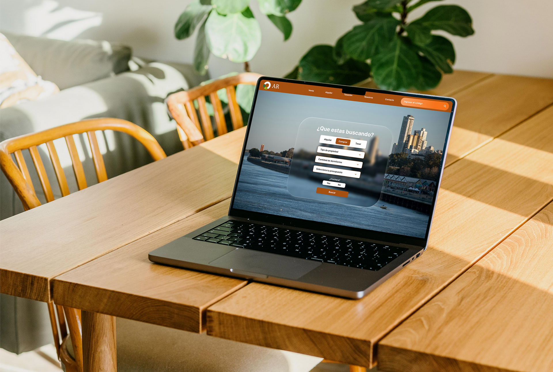
A full redesign for a family-owned real estate agency in Rosario, Argentina. Rebuilding the site from the ground up while preserving the brand equity of their existing logo and physical signage.
MY ROLE
Role
UX & UI designer
Responsibilities
Research, IA, Visual Design
Methodology
Design thinking
Tools
Figma, Claude
OVERVIEW
AR needed a website that matched the trust they'd built over years of physical presence in Rosario. Rather than a visual refresh, this project meant rethinking the entire experience from research to final UI. The logo was redesigned for a more modern feel while staying recognizable to the version already in use on physical signage, preserving the brand recognition the family had built over the years.
CHALLENGE
The existing site no longer reflected the quality of service the agency offered, and lacked the tools modern property seekers expect: clear search, filtering, and direct contact options. The goal was to modernize without losing brand recognition built over years in the local market.
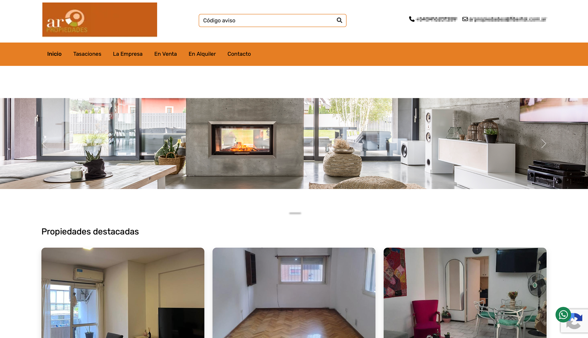
The previous site, in use for several years
RESEARCH
I began with stakeholder interviews to understand service priorities, must-have property details, and the story the client wanted to tell on the About page. This was followed by user questionnaires with potential users, who lead to the creation of user personas to keep in mind the variety of users, including multiple factors like age ranges and tech literacy. Finally, a competitive audit of three local agencies and one international benchmark was conducted to identify gaps and opportunities.
DESIGN PROCESS
With research in hand, I mapped a clear information architecture with multiple entry points on a hierarchical model, prioritizing fast paths to search and direct contact, the two actions users care about most.
Also, a key point to consider was the main audience. Based on age group and average tech literacy, taking a graceful degradation approach was the right path.
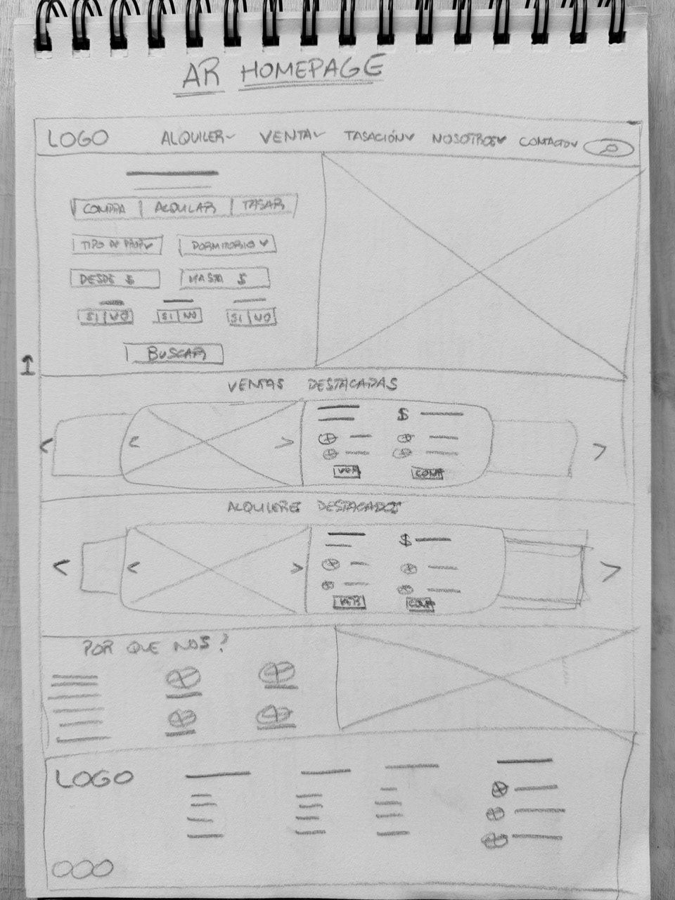
Homepage wireframe
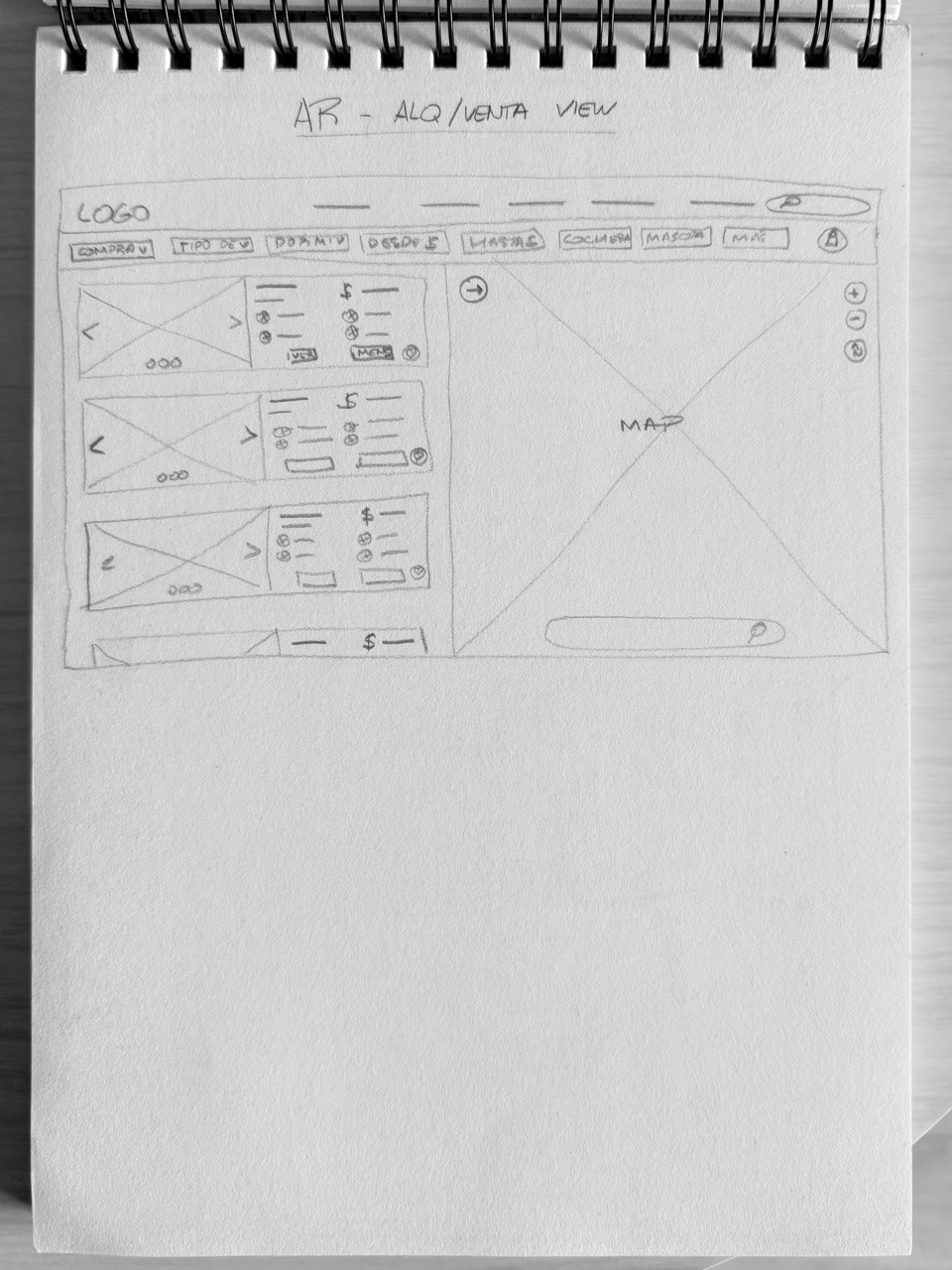
Search page wireframe
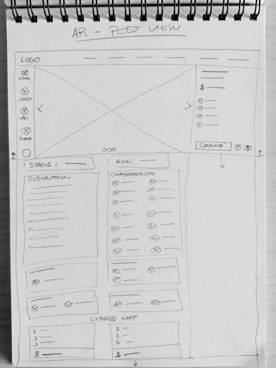
Property view wireframe
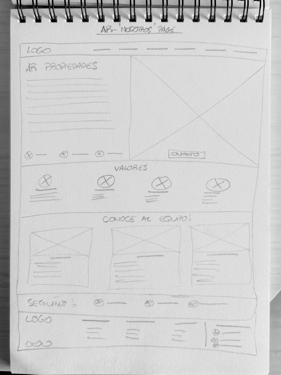
About us wireframe
The original palette, already established through years of physical signage, was refined rather than replaced. Tones were adjusted for better contrast and consistency across digital contexts, giving the brand a more modern feel while staying instantly recognizable to existing clients.
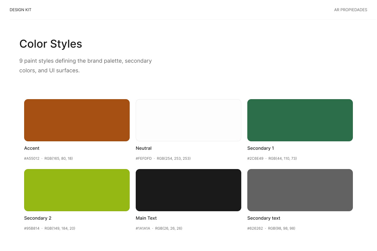
AR color palette
Type choices prioritized accessibility over trend. Given that the target audience skews toward adults with varying levels of tech literacy, I selected typefaces with high legibility at small sizes, clear character distinction, and generous spacing, reducing friction for users less comfortable navigating digital interfaces.
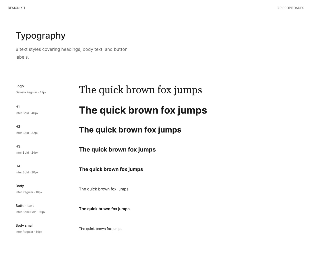
AR typefaces
The logo was redesigned with a lighter, more contemporary execution while preserving its core structure and identity, ensuring it remained immediately recognizable to clients familiar with the agency's physical signage and existing brand presence.
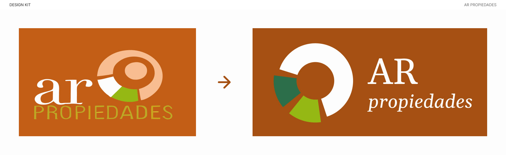
AR logo update
THE OUTCOME
The result is a clean, trust-driven website that gives the agency a modern digital presence without losing the recognizability built over years of local reputation. Clear search and filtering, direct WhatsApp integration, and a simplified inquiry flow make it easier for property seekers, including less tech-savvy users, to find what they need and reach out with minimal friction.
HOMEPAGE
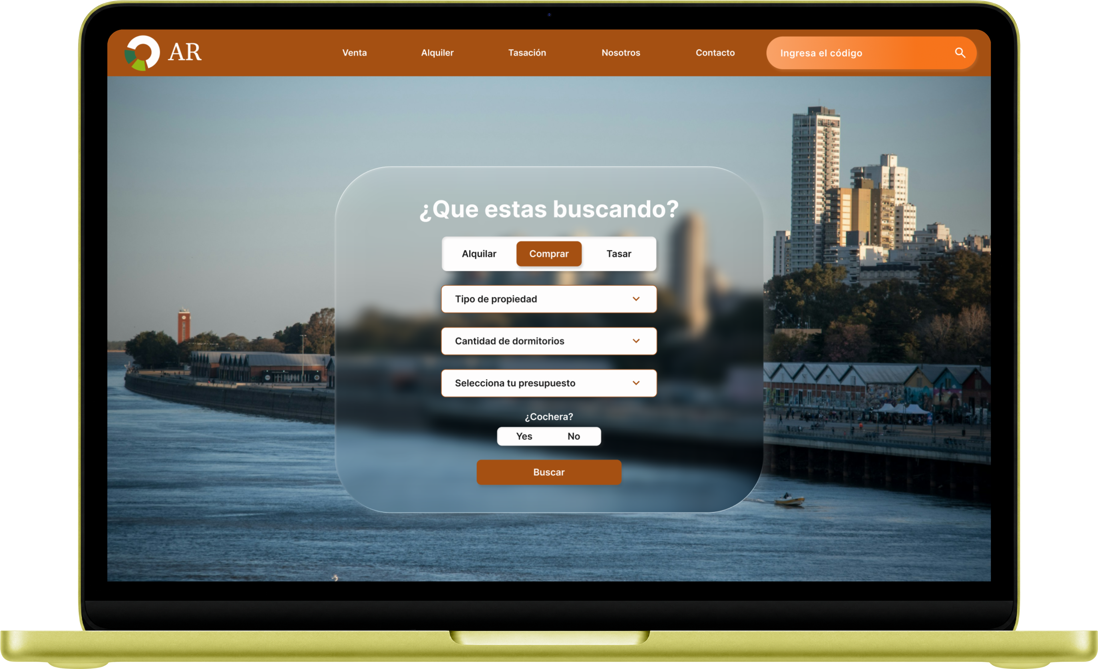
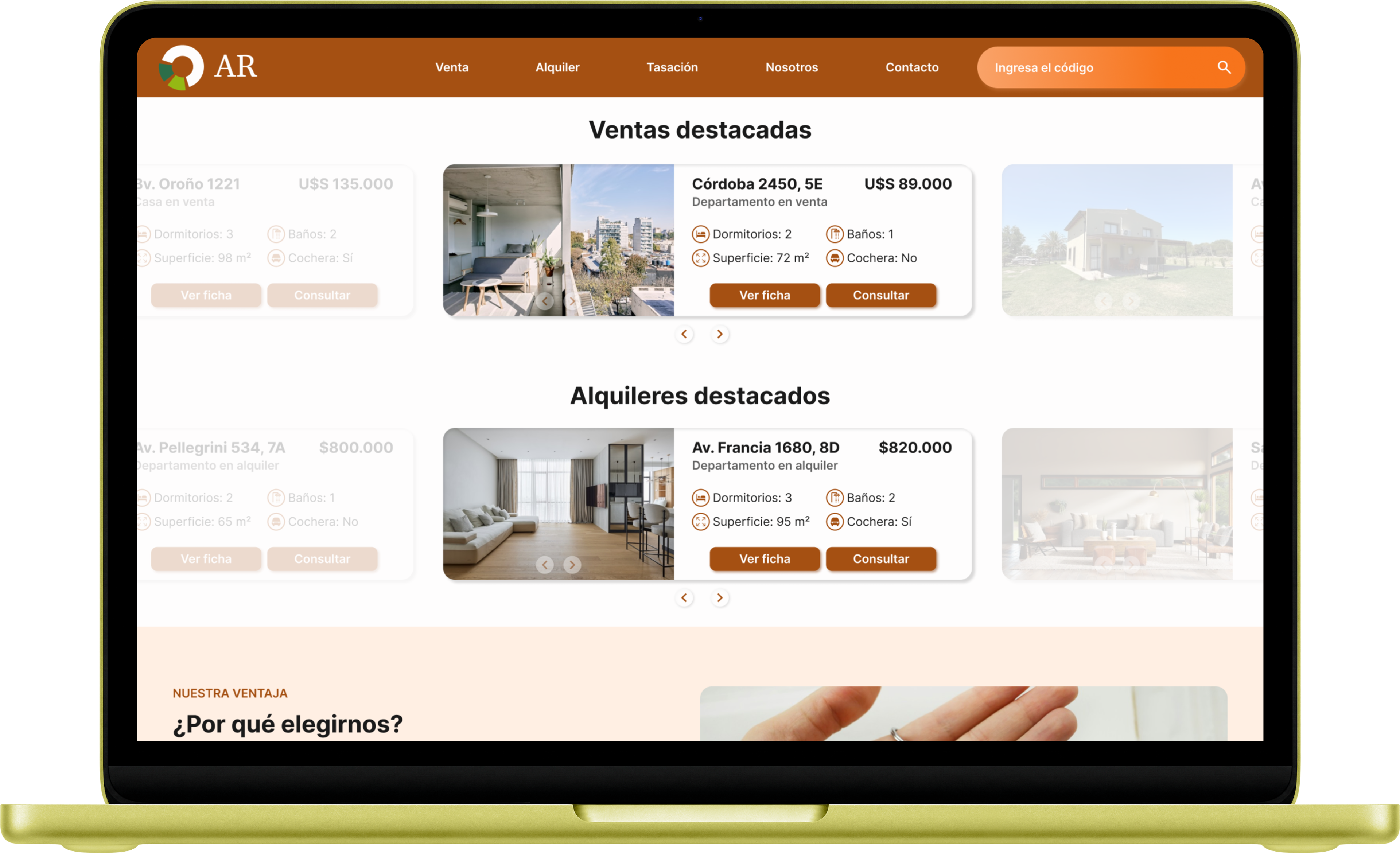
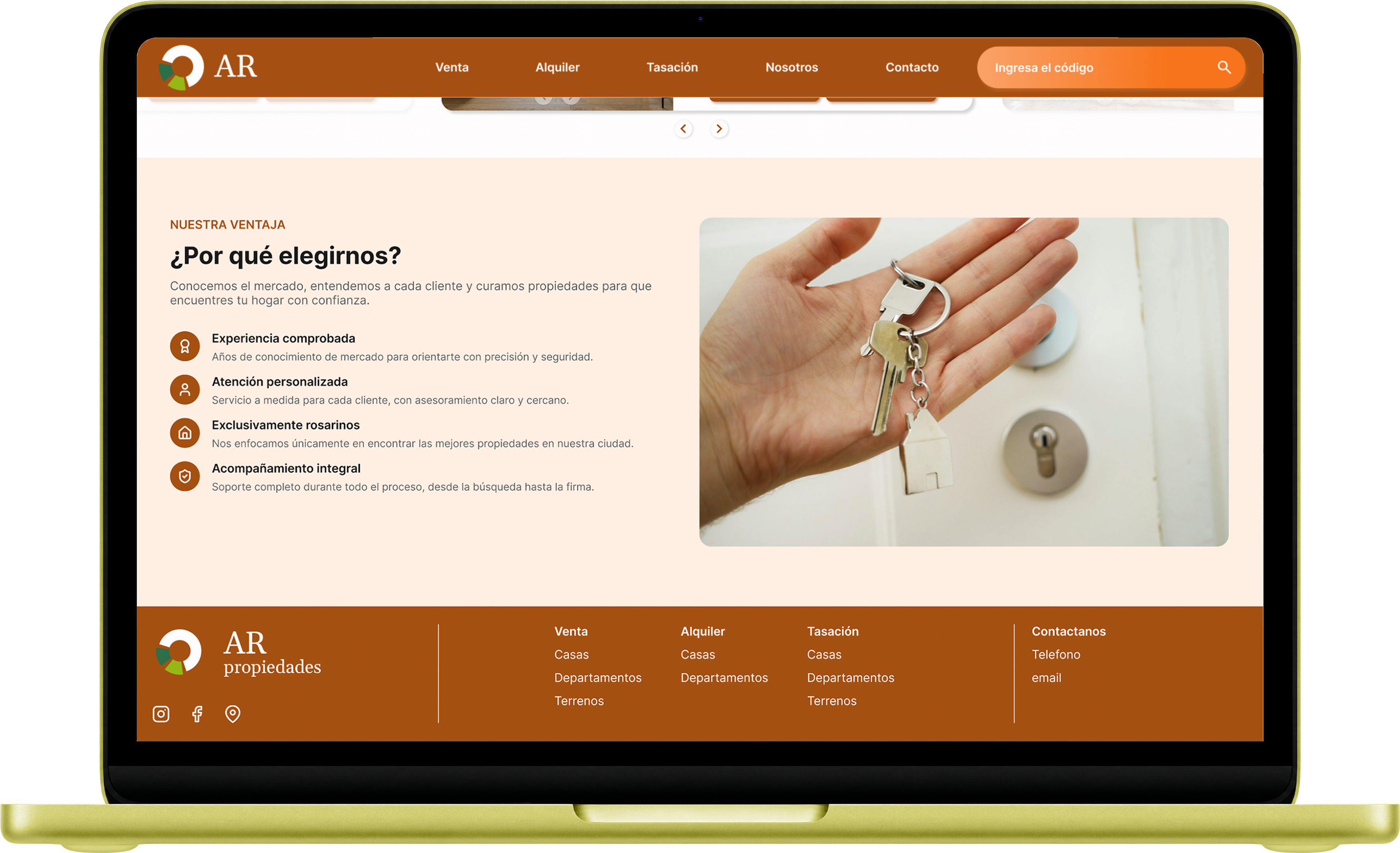
A fixed top navigation bar and a prominent search input above the fold let users start searching immediately. Below, featured listings for both sale and lease are shown in card format, followed by a "Why choose us" section and a footer housing full navigation, contact info, and socials.
SEARCH PAGE
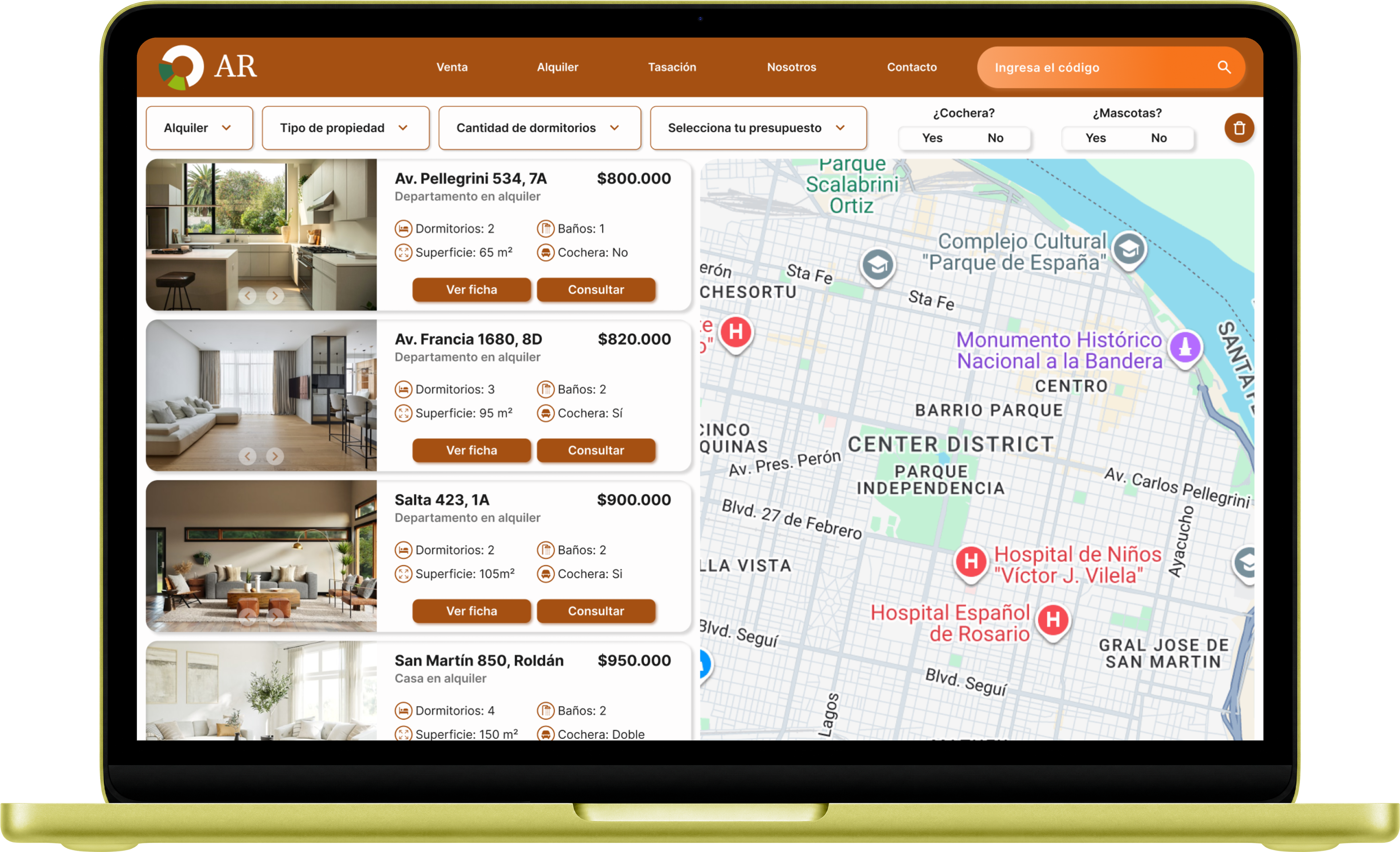
A two-column layout pairs a scrollable list of property cards with an interactive map, connected by a filter bar tied directly to the homepage search input. Each card shows the essentials: address, type, price, rooms, size, garage, with two clear CTAs: view full details or inquire directly.
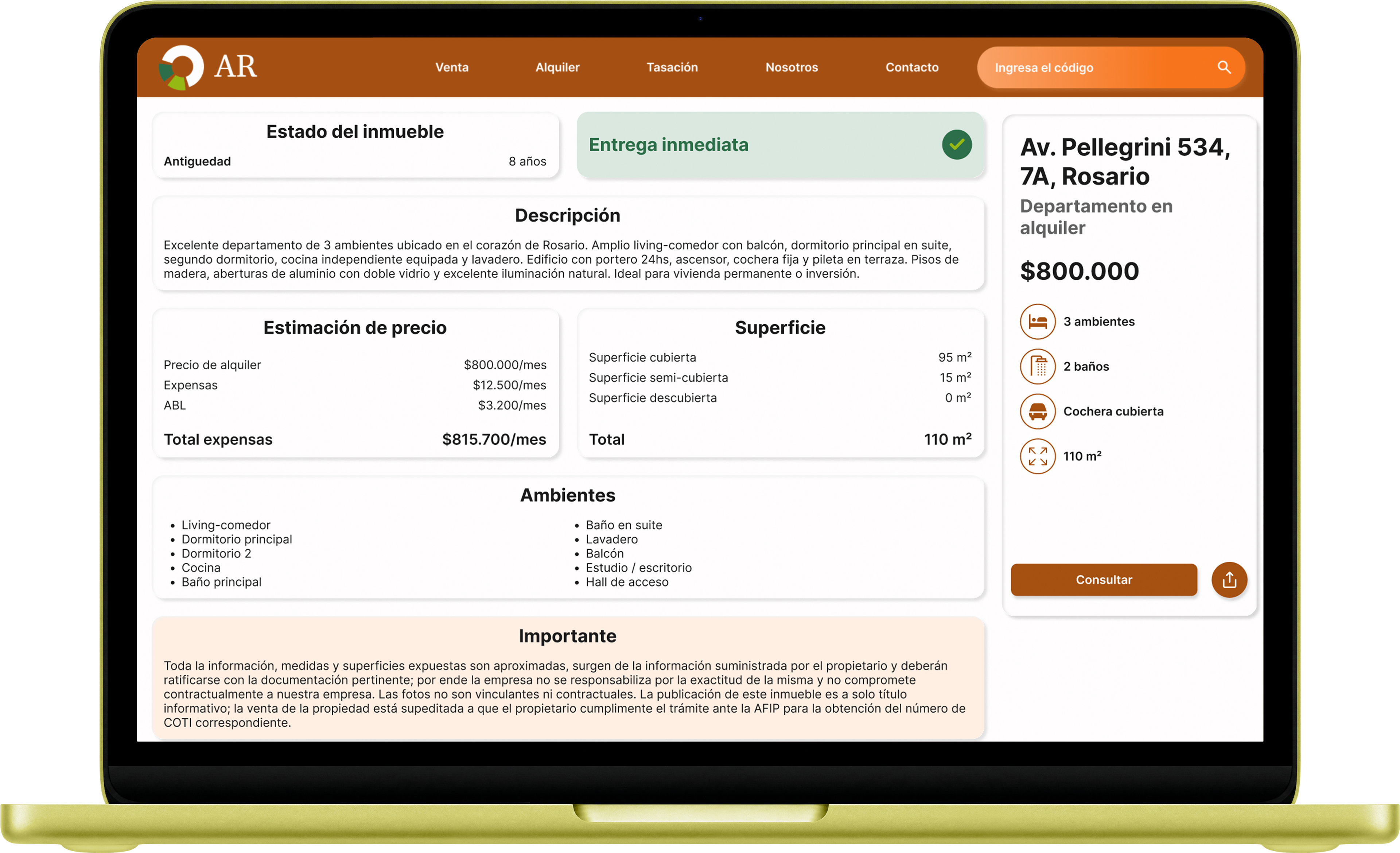
Property page
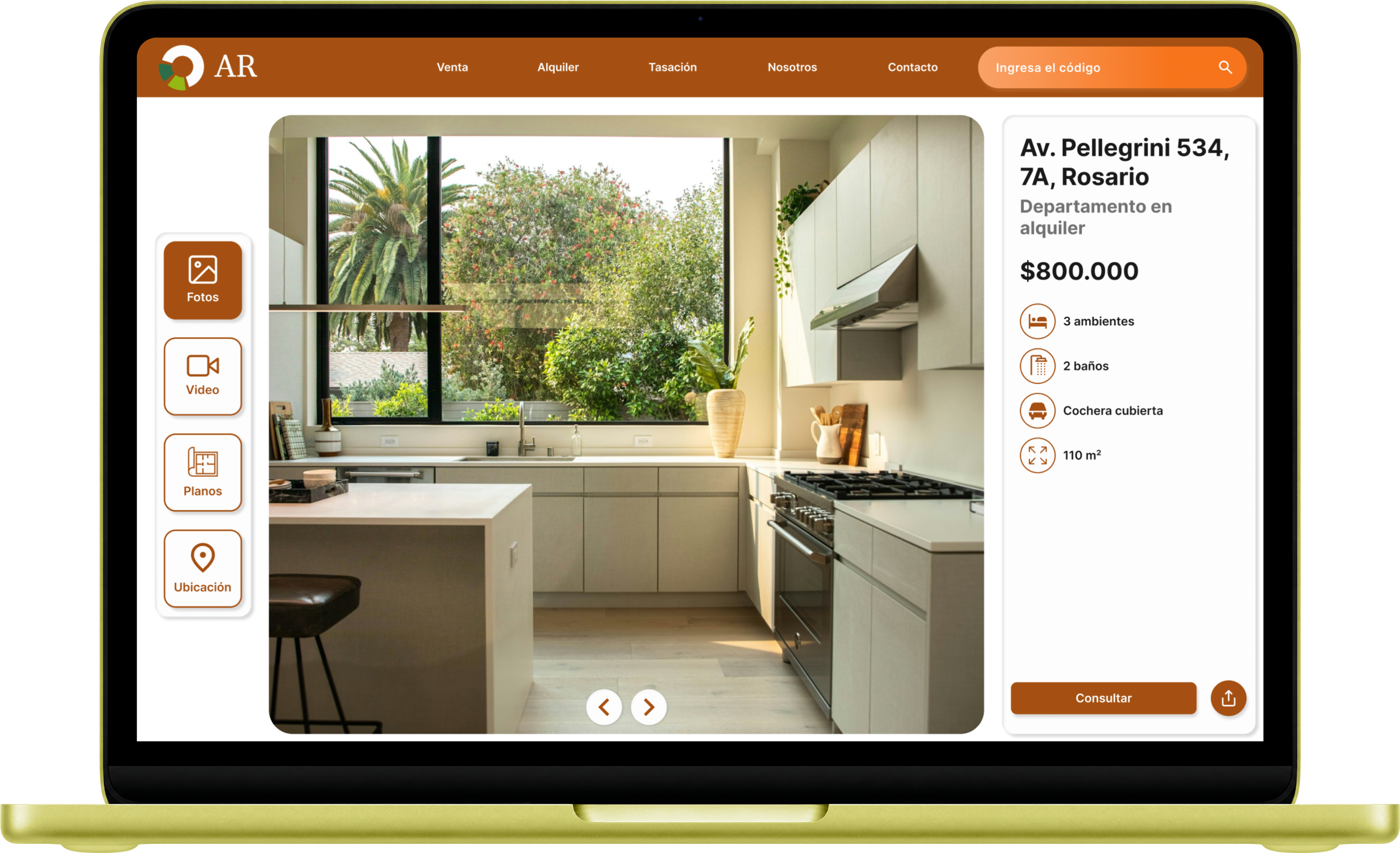
An image carousel with a vertical control bar lets users move between photos, video, location, and architectural drawings. Below, information is grouped using Gestalt principles for clarity. A fixed sidebar keeps key details and two CTAs always visible: an inquiry form (with the option to message via the site or open WhatsApp — the standard for communication in Argentina) and a share overlay.
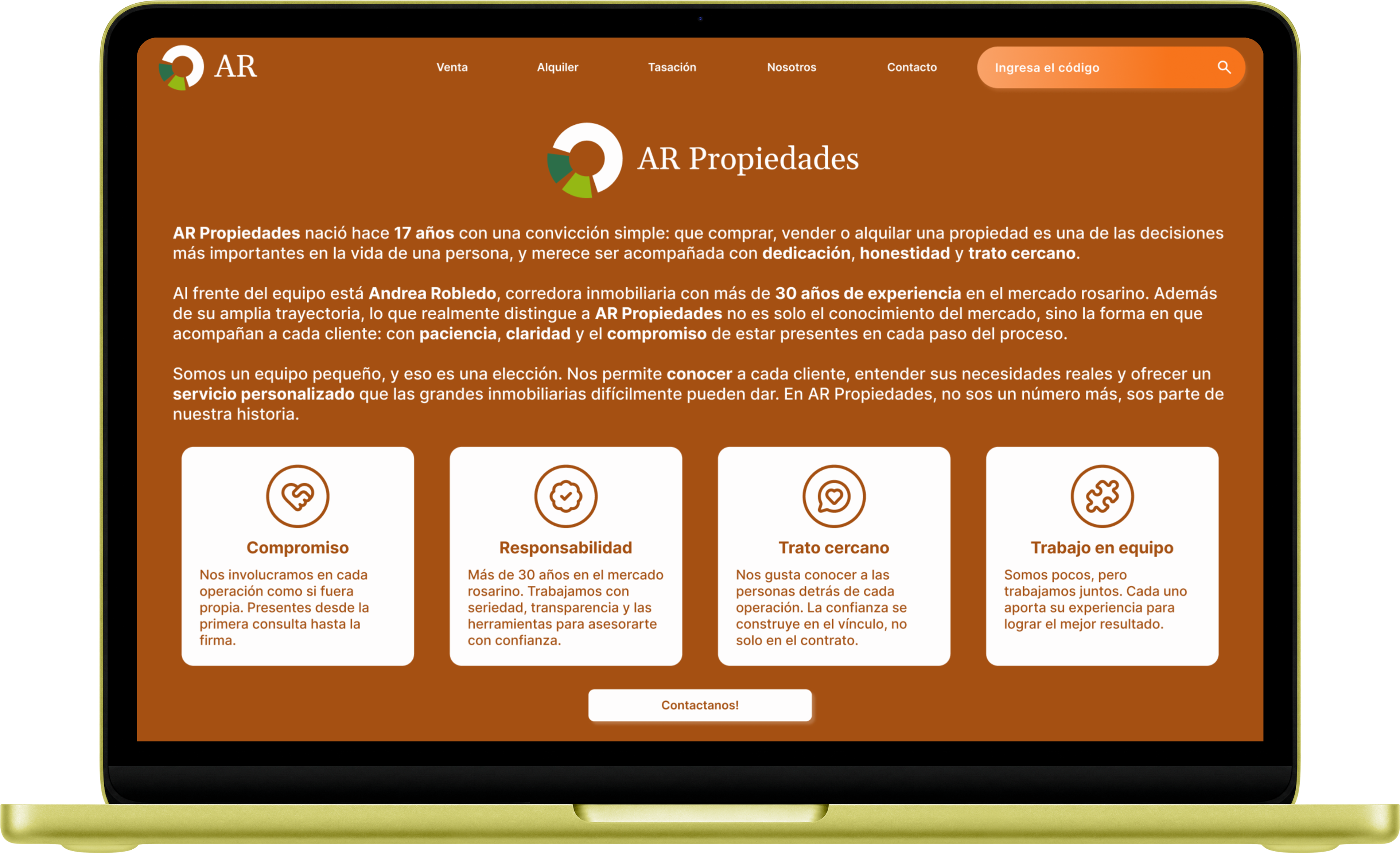
ABOUT PAGE
Kept intentionally simple per the client's wishes: a strong logo/name moment, a brief company story, four core-value cards, and a CTA into the contact page.
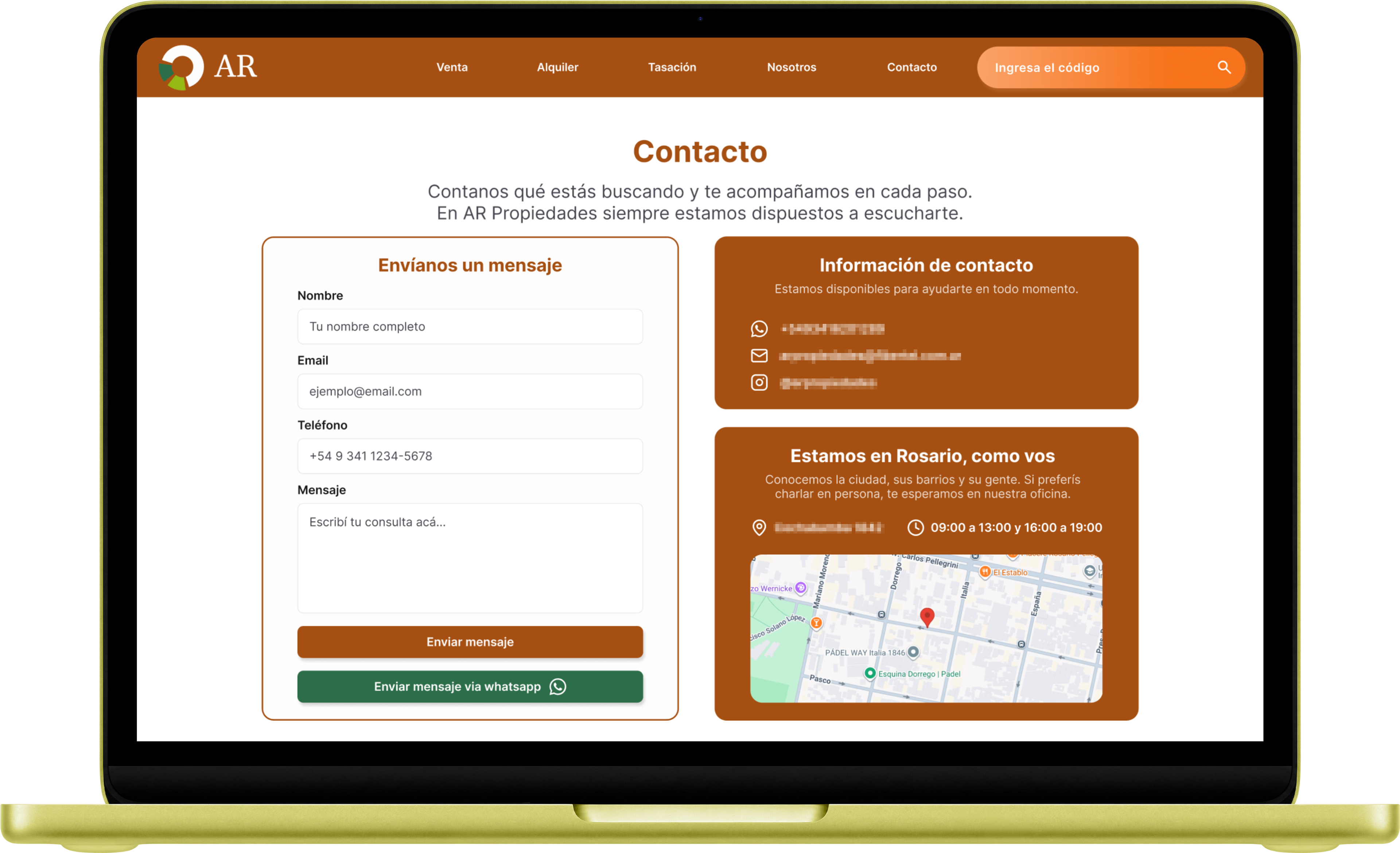
CONTACT PAGE
A two-column layout combines a contact form (site or WhatsApp) with a card showing contact details and a second card featuring the address alongside a mini map.
Try out the Hi-Fi prototype here!
TAKEAWAYS
Designing for real-world constraints
Balancing a client's brand equity with modern usability meant every decision, from color to typography, had to serve both recognition and accessibility. This project reinforced how much research and restraint matter when redesigning for a business with an established local reputation.
Localizing for context, not just language
Real localization goes beyond translating text. Property prices reflect local market conventions, sale prices in USD and rent in ARS, matching how the market actually prices and discusses real estate. Contact defaults to WhatsApp, the standard communication channel in Argentina. These details aren't obvious to an outsider, but they're the difference between a site that works globally and one that works for the people actually using it.
This project is currently under development. Updated visuals and a live link will be added as the build progresses.
ADDITIONAL LINKS
In case you want to see translated mockups in English, click here!